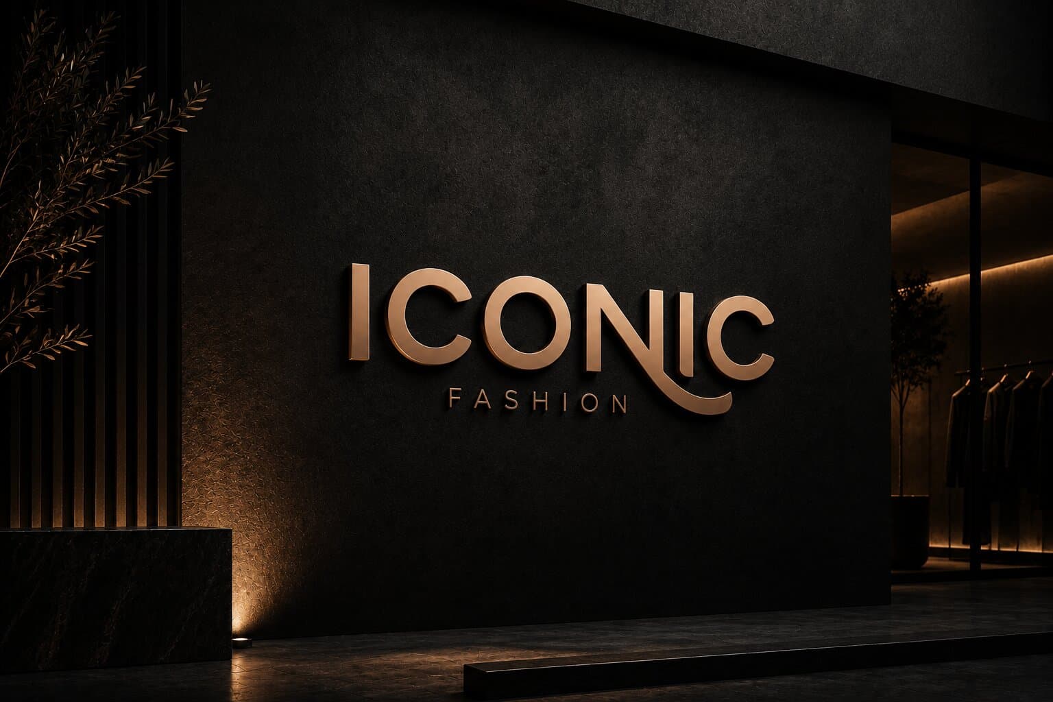
The Mark
A sleek, stylish typeface, the design exudes confidence and luxury, making Iconic a timeless statement in fashion.

Project Card
Client:
Shiftat
Industry:
Fashion Retail
Services:
Graphic Design, Branding, Social Media, Printables
Timeline:
2 Weeks
Collaborators:
Iconic Fashion is a fashion retailer inside a large local mall, one storefront among dozens a shopper passes in a matter of minutes — so the brand's first job was simply to stand out. It had no consistent visual language: signage, garment tags, printed material and social posts had each been designed in isolation, so nothing accumulated into recognition. The work had to establish a single identity confident enough to be read at a glance from across a walkway, and flexible enough to carry from the shopfront to a printed tag to a feed.
Establish a distinctive, memorable identity that resonates with the target audience, stays consistent across every touchpoint, and gives the brand a clear, confident voice to grow with.
A sleek, stylish typeface, the design exudes confidence and luxury, making Iconic a timeless statement in fashion.
A sleek, stylish typeface, the design exudes confidence and luxury, making Iconic a timeless statement in fashion.
A grounded, wearable palette. The primaries carry the everyday brand; the secondaries are held back for campaign and seasonal moments.
Primary
Warm brown
#A0603D
Earth and craft. The most tactile colour in the set, closest to leather and raw fabric, and the one that carries the brand day to day.
Soft peach
#F6D2B5
Skin-warm and approachable. It softens the palette and does the quiet work behind lookbook and product photography.
Muted sage green
#A5B9A1
Calm and considered. The balance that keeps the identity from tipping into something loud or seasonal.
Secondary
Burnt orange
#E04622
Energy in small doses. Reserved for campaign moments and anything that has to be acted on.
Deep navy
#171C34
Authority and depth. It anchors packaging and gives the palette the contrast the neutrals cannot.
Soft yellow
#F6E984
A seasonal lift. Used sparingly to signal new arrivals and warmer drops without redrawing the palette.
Oswald carries structure and presence; Abril adds editorial warmth. Together they cover signage through to campaign headlines.
Oswald
_Condensed, structural, built to be read at distance.
Headlines · Signage · Labels
Abril
_High contrast, editorial warmth, reserved for moments.
Editorial · Campaign · Accents
A small set of marks that extend the identity past the logo — used where the full wordmark would be too much.
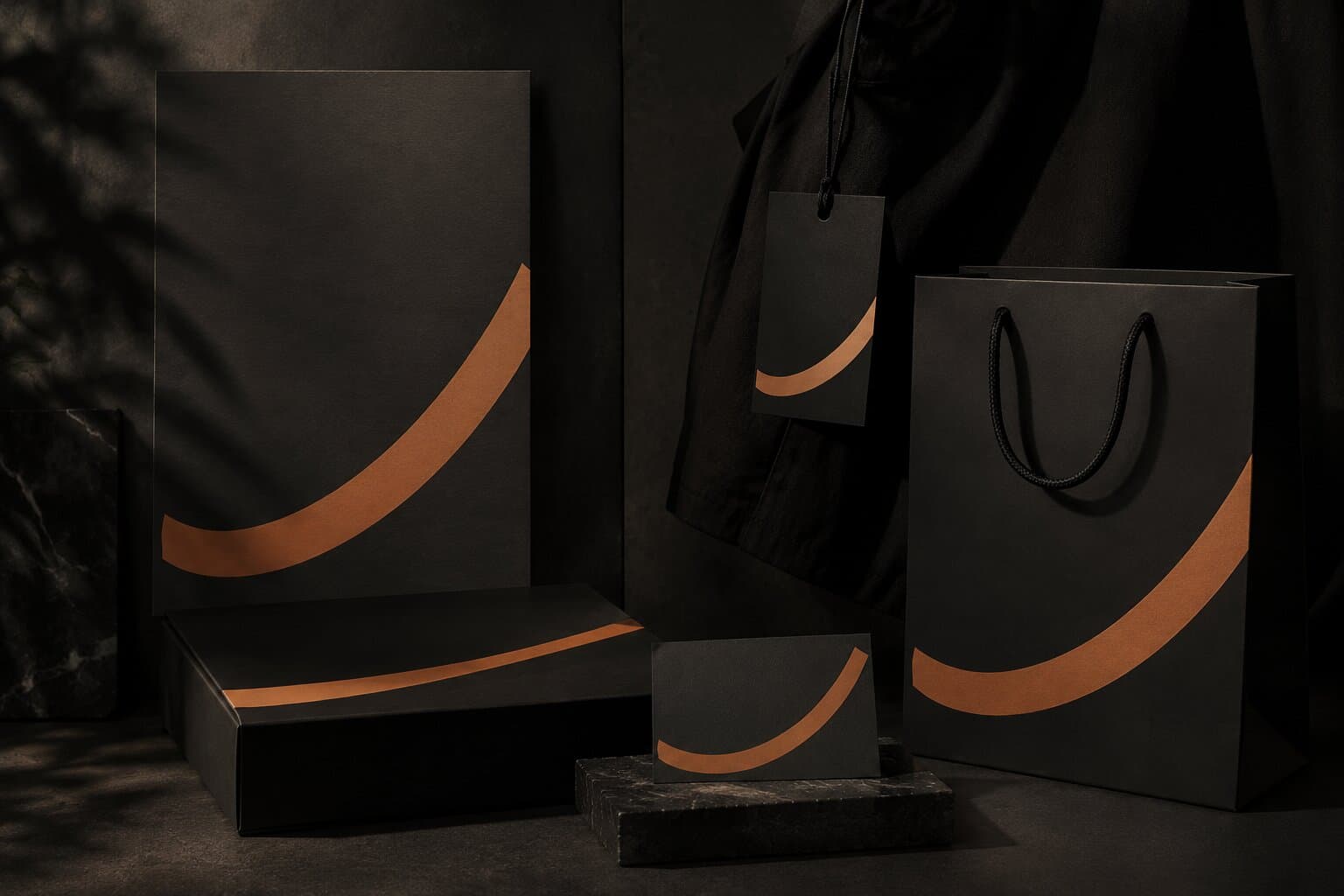
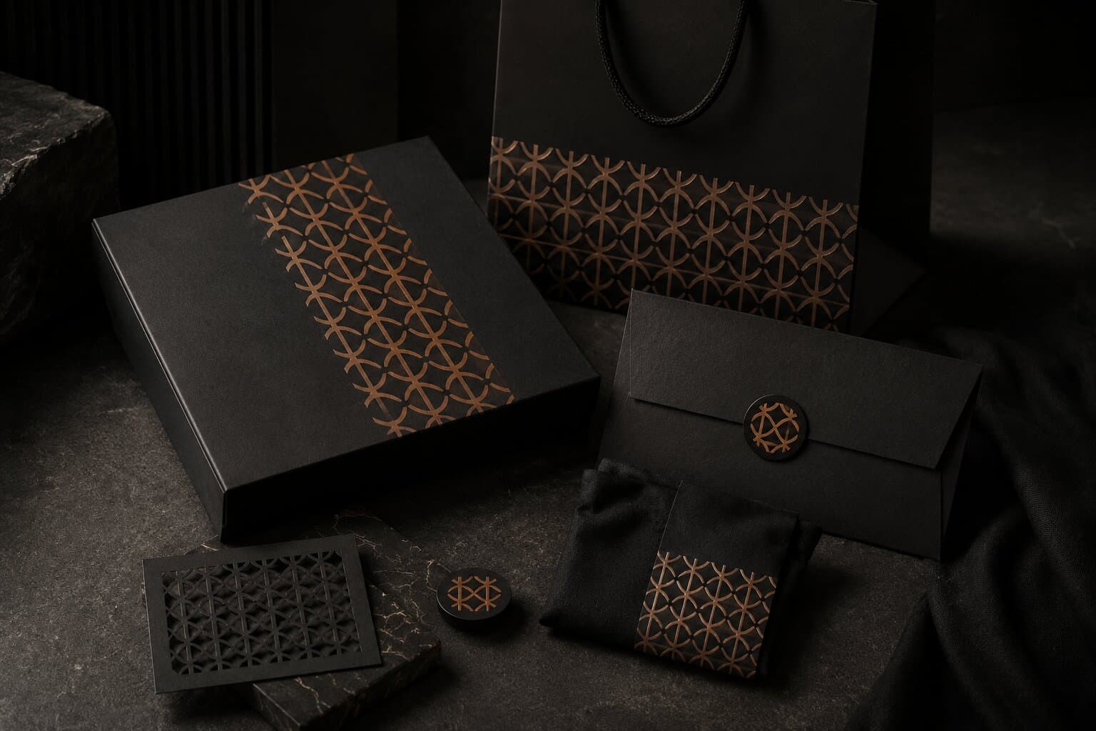
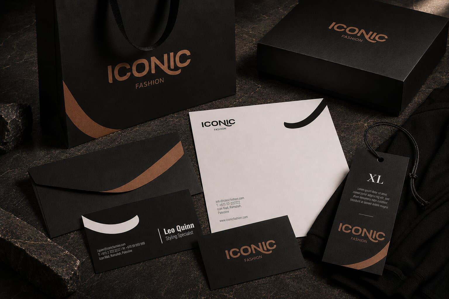
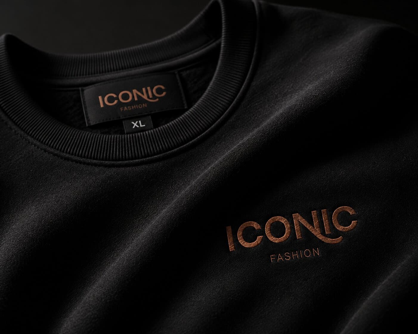
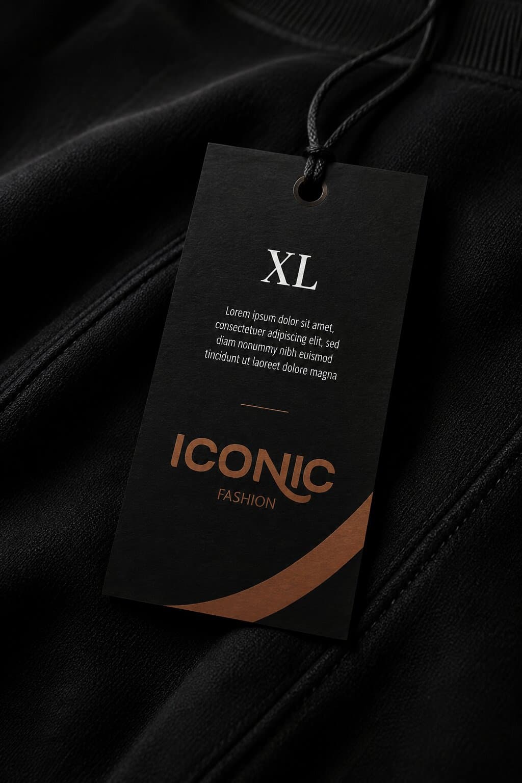
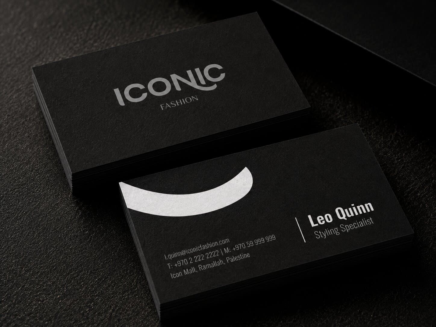
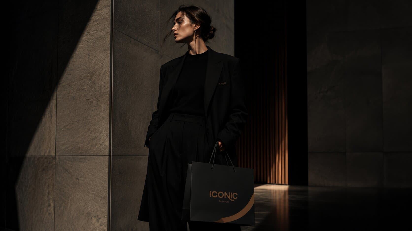
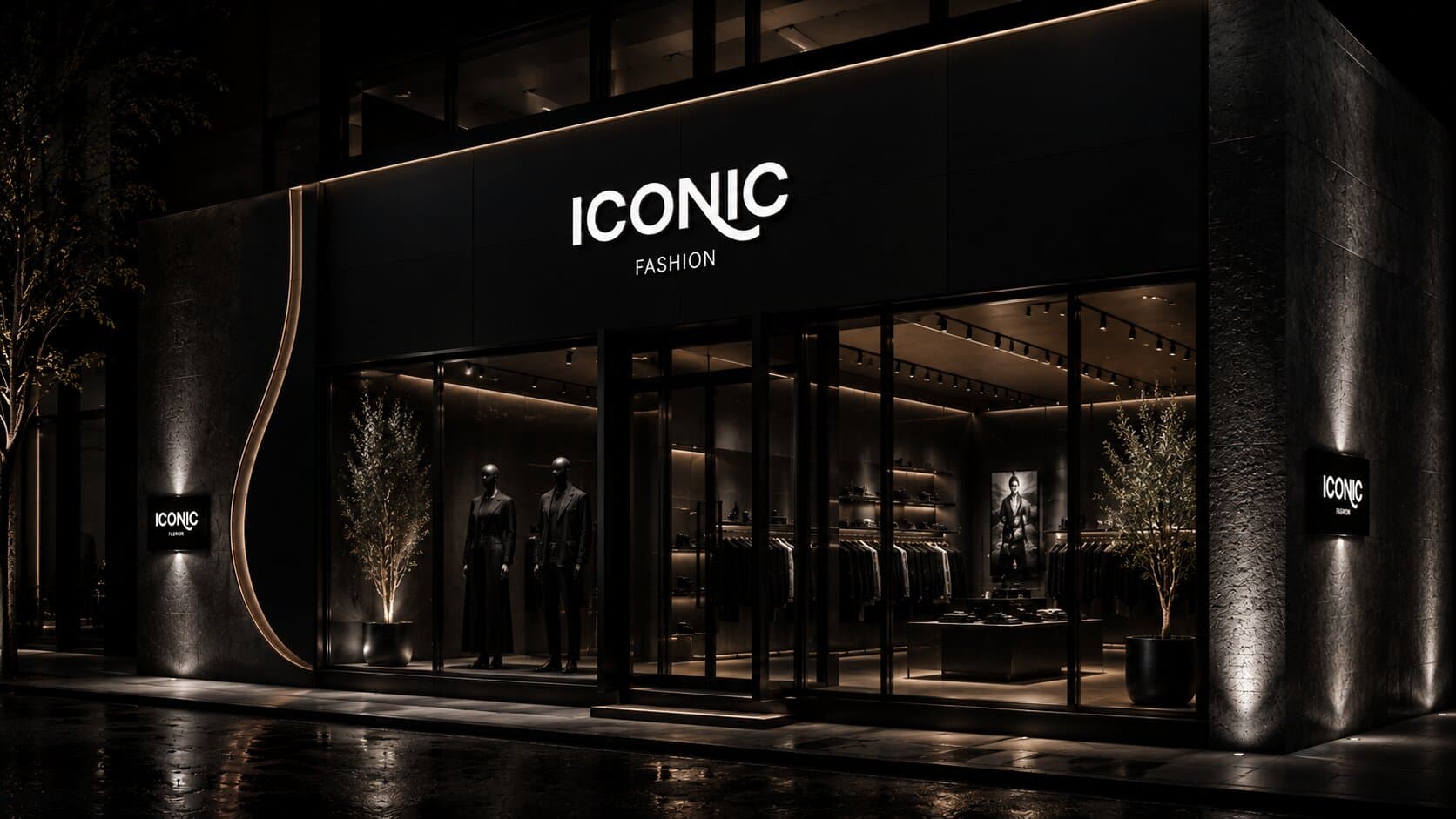
The identity in the wild — product, packaging and campaign imagery shot as the brand ships.
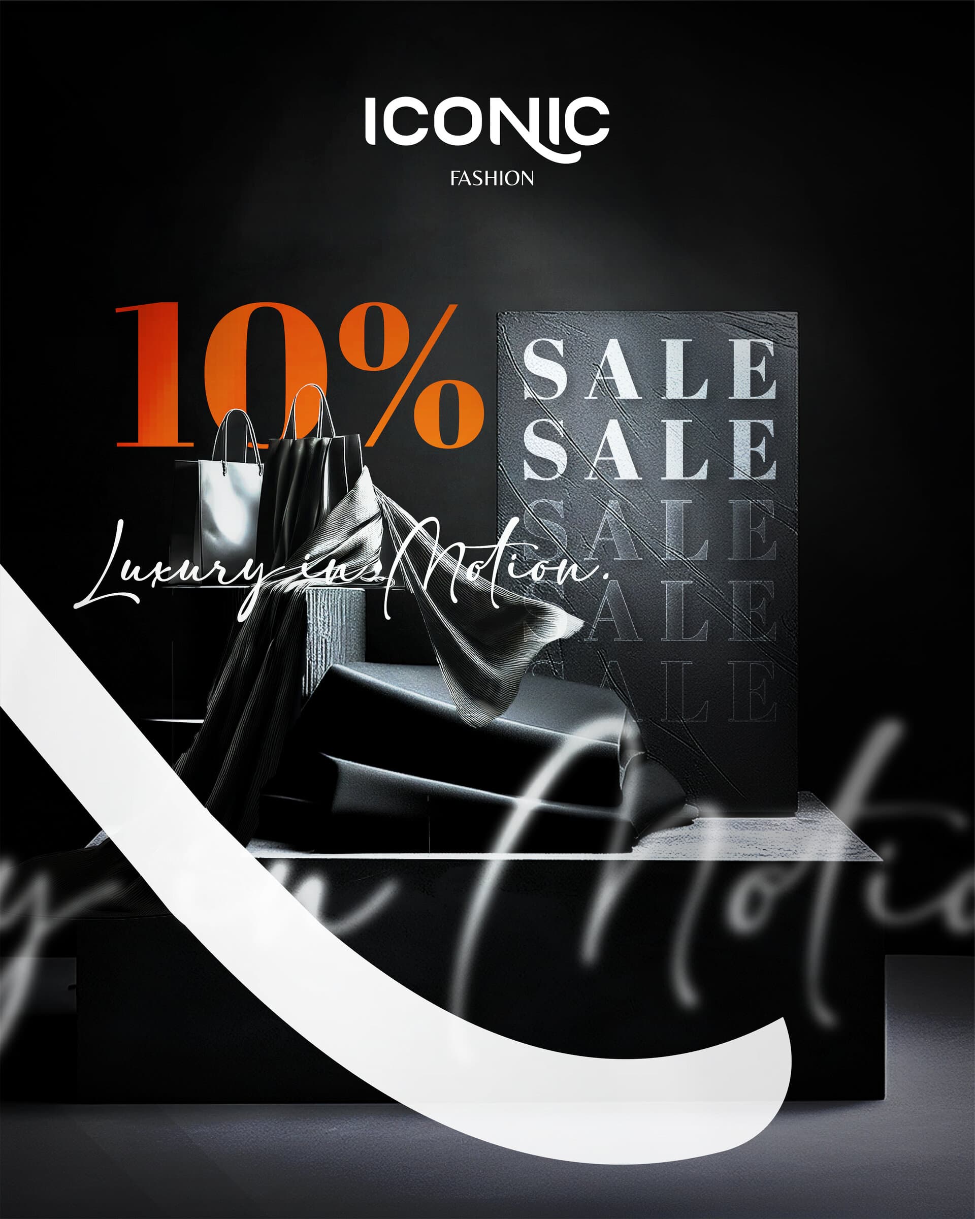
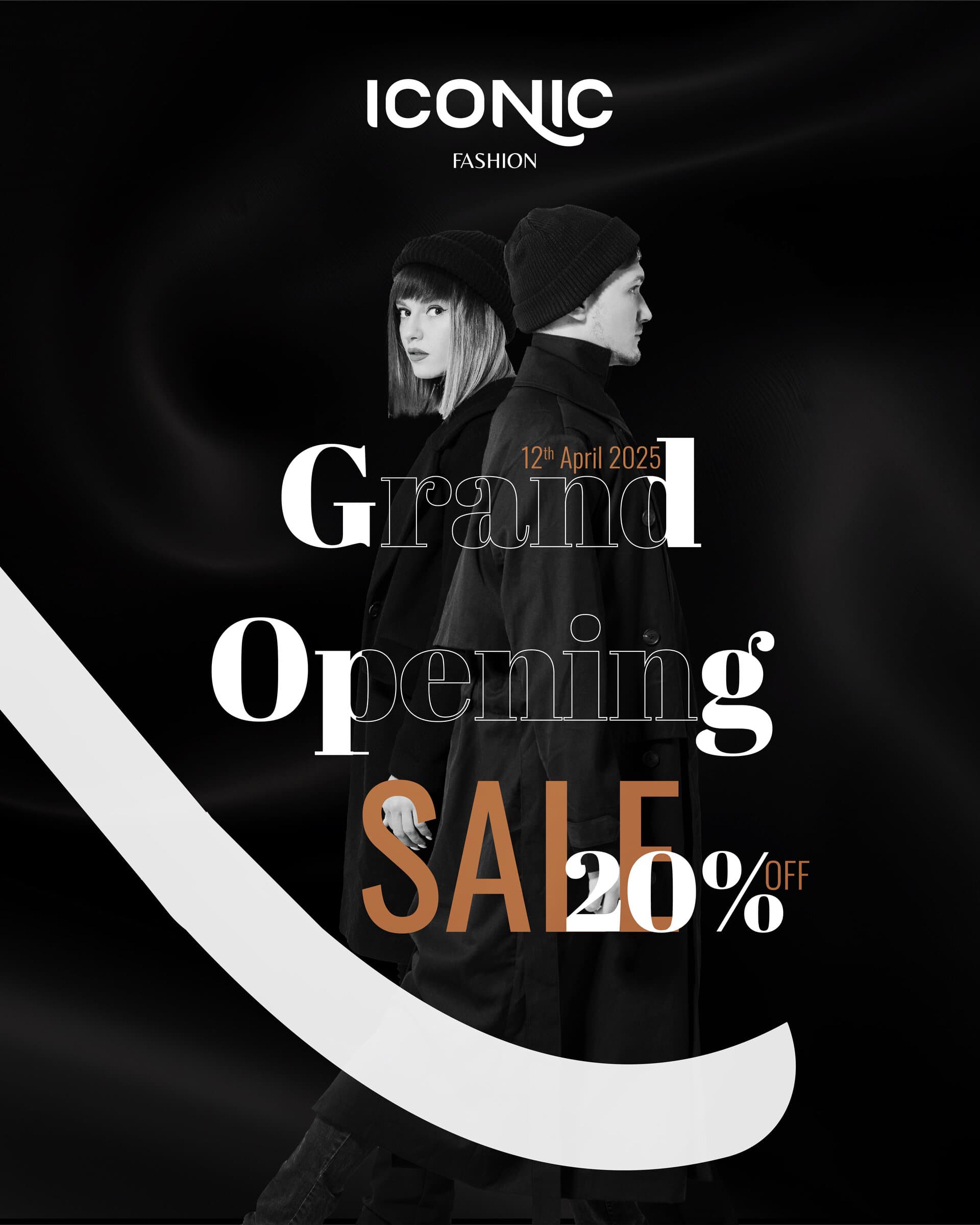
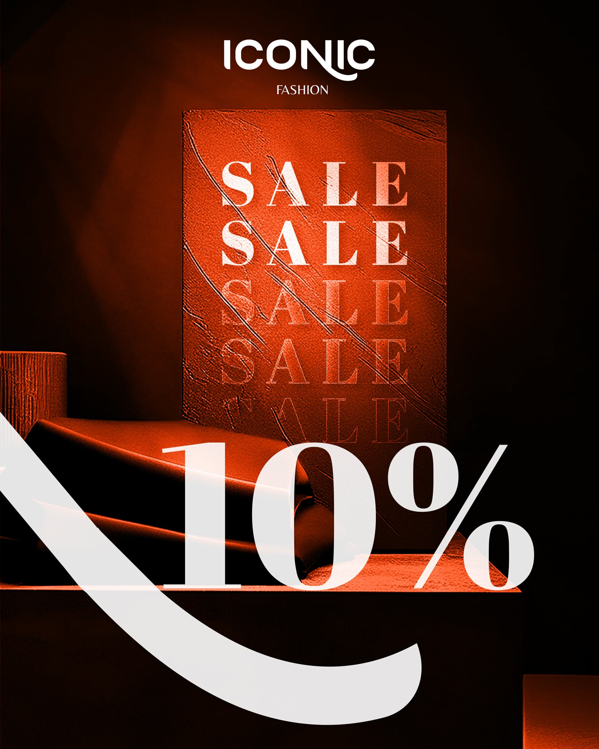
The identity was built to scale. The same proportions that anchor the wordmark on a garment tag hold it steady across printed collateral, packaging and campaign imagery. In the store itself it carries signage and window graphics without adjustment — one system, applied from a woven label to a shopfront.
All work shown here was produced for Shiftat / Iconic Fashion. Brand assets, imagery and trademarks remain the property of the client and appear here for portfolio purposes only.
The new identity gave Iconic a consistent presence across signage, packaging and social channels for the first time. Staff had a clear system to work from, so seasonal collections and campaigns could be produced in-house without a redesign each time — turning what had been ad-hoc, one-off design requests into a repeatable kit.
The challenge was creating a distinctive logo with enough presence to stand out in a busy local mall. The final identity balances simplicity with a strong, memorable character, creating a foundation that can grow across retail, digital, and seasonal applications.
Tell us where you're headed, and we'll help you get there!
Drop us an email!
info@eureka-creative.studioEureka Creative Studio 2026