
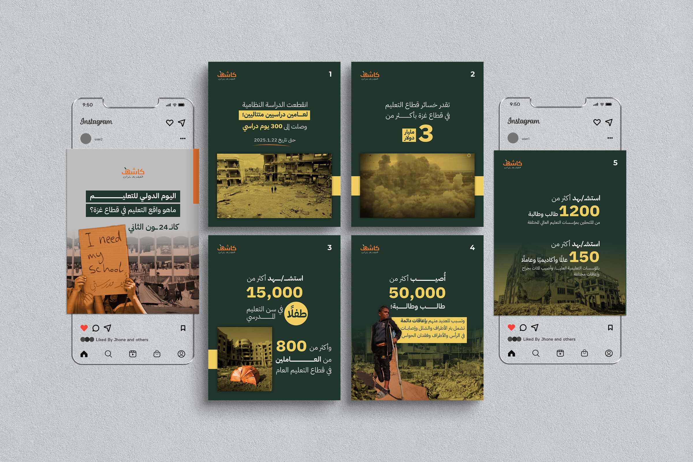
Project Card
Client:
Kashif
Industry:
Independent Media
Services:
Social Media, Graphic Design
Timeline:
Ongoing
Collaborators:
Challenge
Kashif is an independent media outlet working against rumour and fake news — checking claims, correcting them, and spreading awareness along with the facts. Its audience meets the story mid-scroll, between everything else on a feed, and the material is dense: displacement figures, verification chains, claims and the evidence that undoes them. The identity had to look independent and credible at a glance, and give dense reporting a form that survives being read at speed on a phone.
Goals
Build one visual system rather than a run of posts: a fixed typographic hierarchy so a headline, a statistic and a caption always look like themselves, a small palette that keeps photography readable underneath it, and a set of graphic devices that mark what matters without shouting. It had to be assemblable quickly — the reporting does not wait for a design cycle.
Creative Direction
Research
- Target Audience
- People who follow the story from outside it — reached on a phone, in a feed, with a second or two to decide whether to stop.
- Platform & Competitor Research
- Feed-native reporting lives or dies on the first frame. Accounts that work lead with one figure or one line, not a paragraph, and keep a recognisable frame from post to post.
- Key Insights
- The numbers are the story. Anything that competes with them — texture, effects, a second accent colour — costs the post its point.
The Visual Language
One hierarchy, four colours and a small set of marks — fixed, so every post is assembled rather than designed from scratch.
Colors
Four, so photography stays readable underneath.
Typography
Four steps, and nothing between them.
Headline
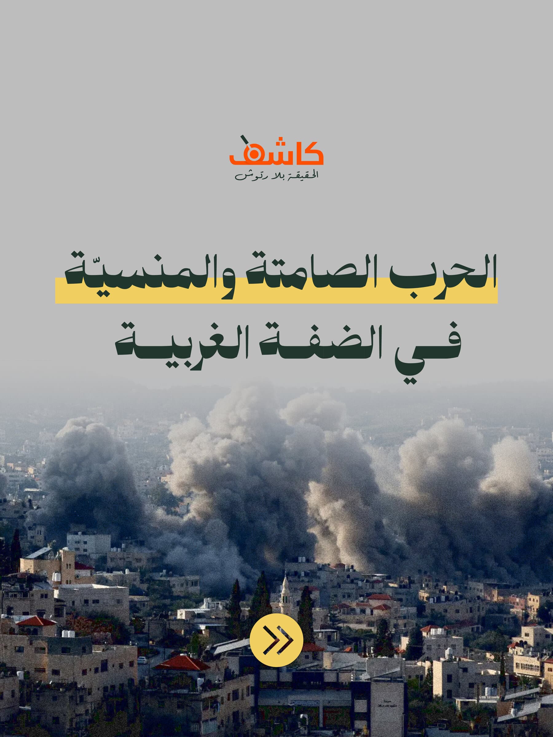
Silent & Forgotten War
Subhead
The West Bank's
Figure
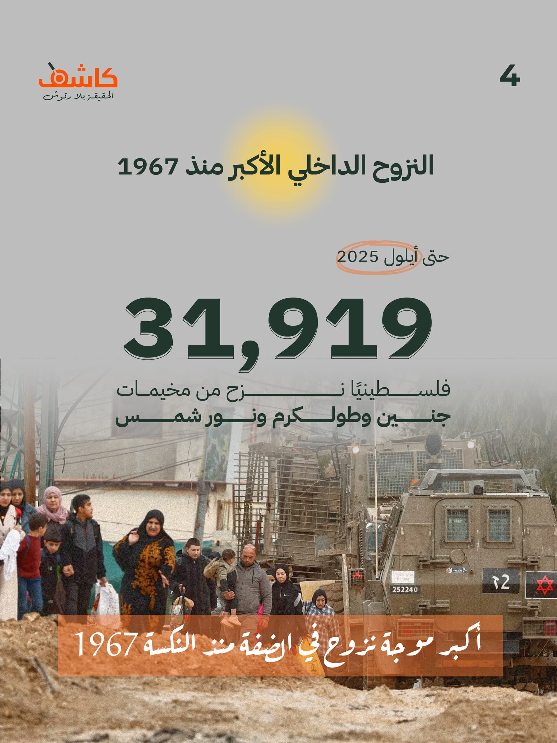
31,919
Body
Uncovering the violence, displacement, and human cost behind the world's silence.
Graphic Elements
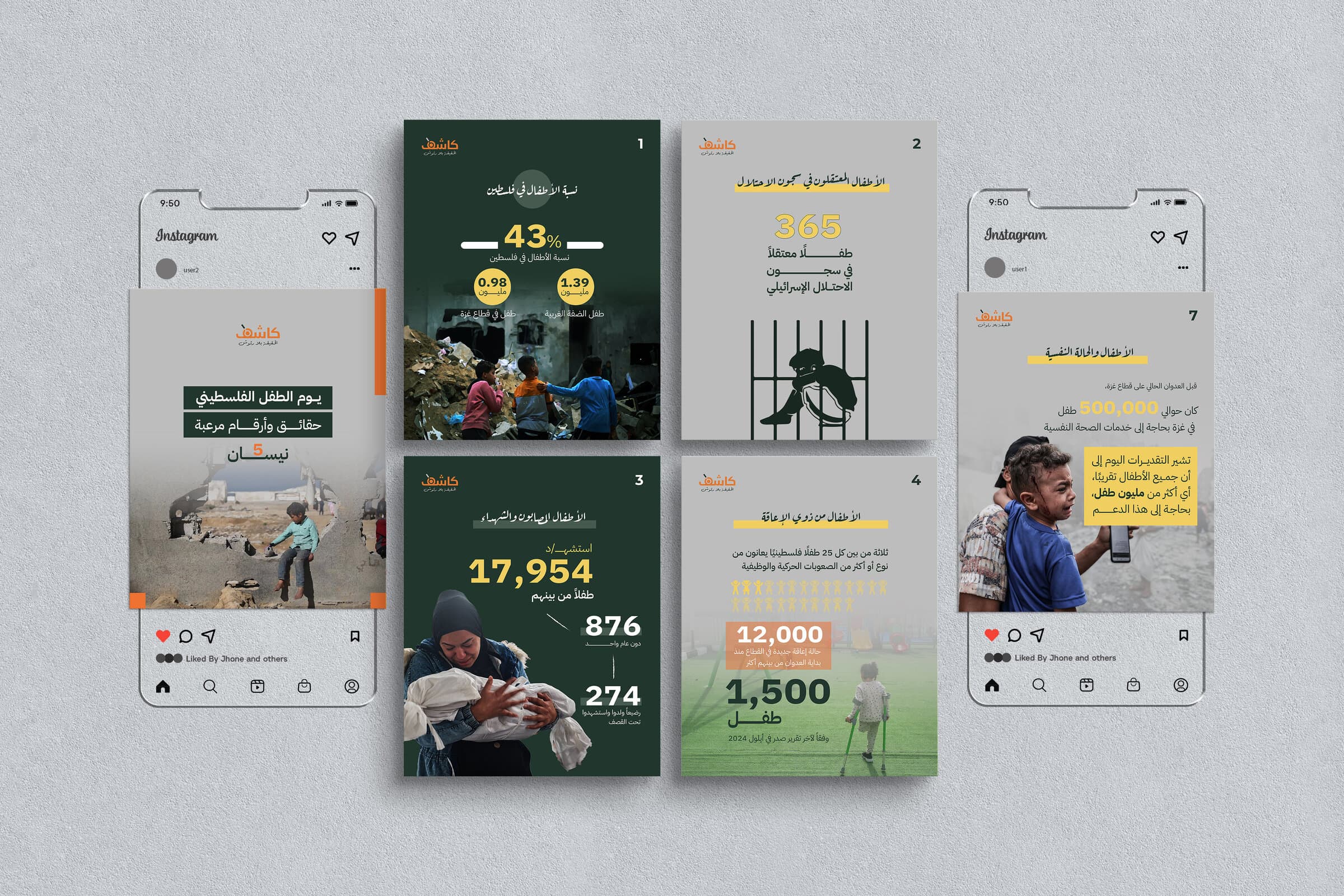
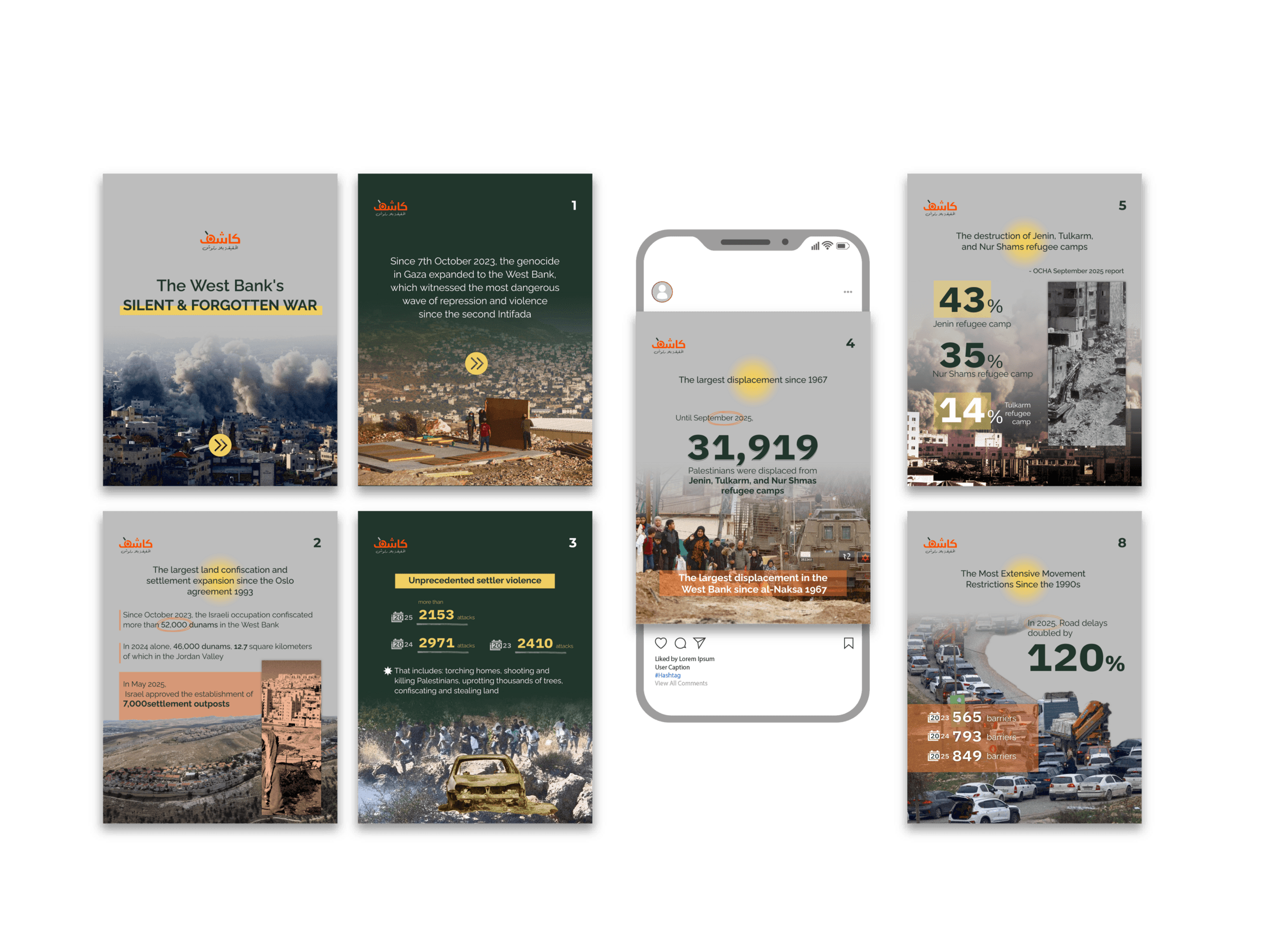
The highlight band, the chevron and the figure blocks — the marks that say what to read first.
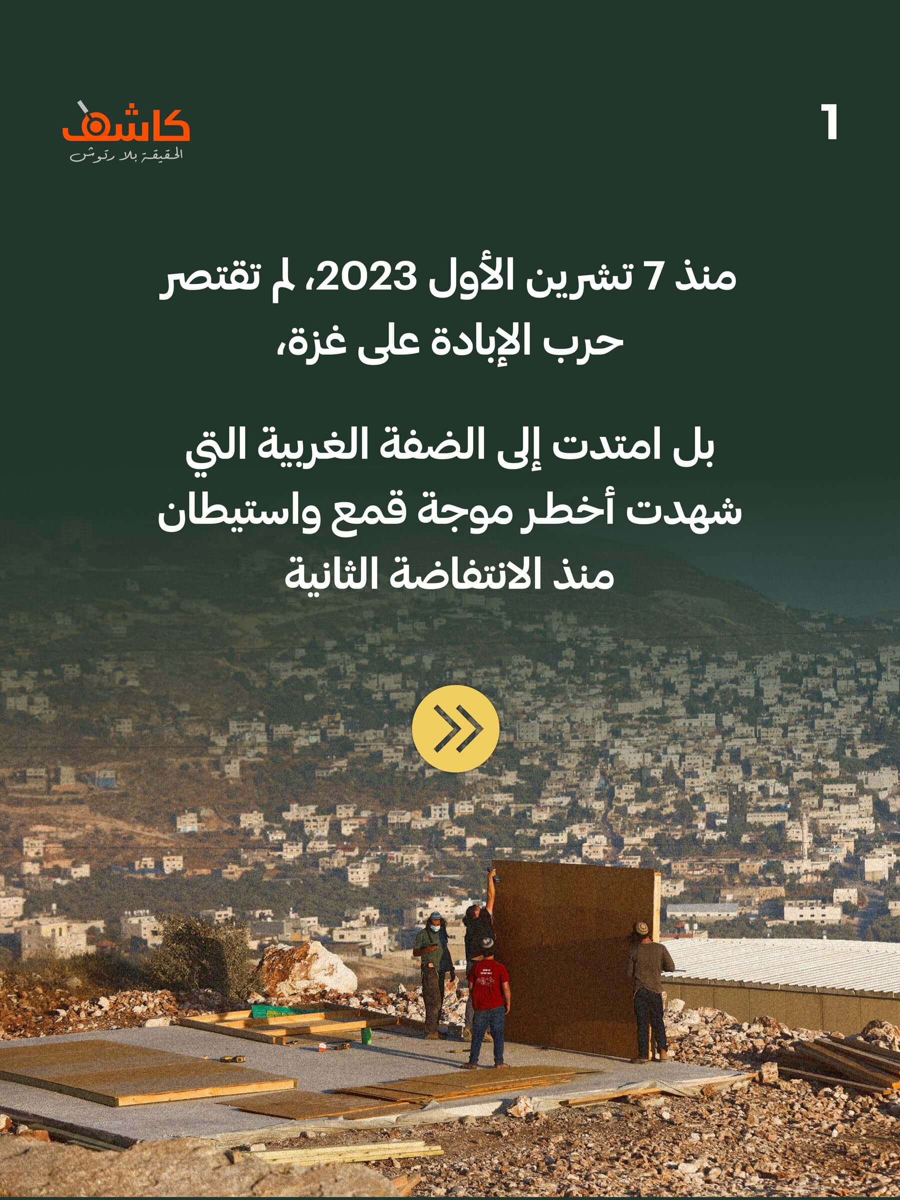
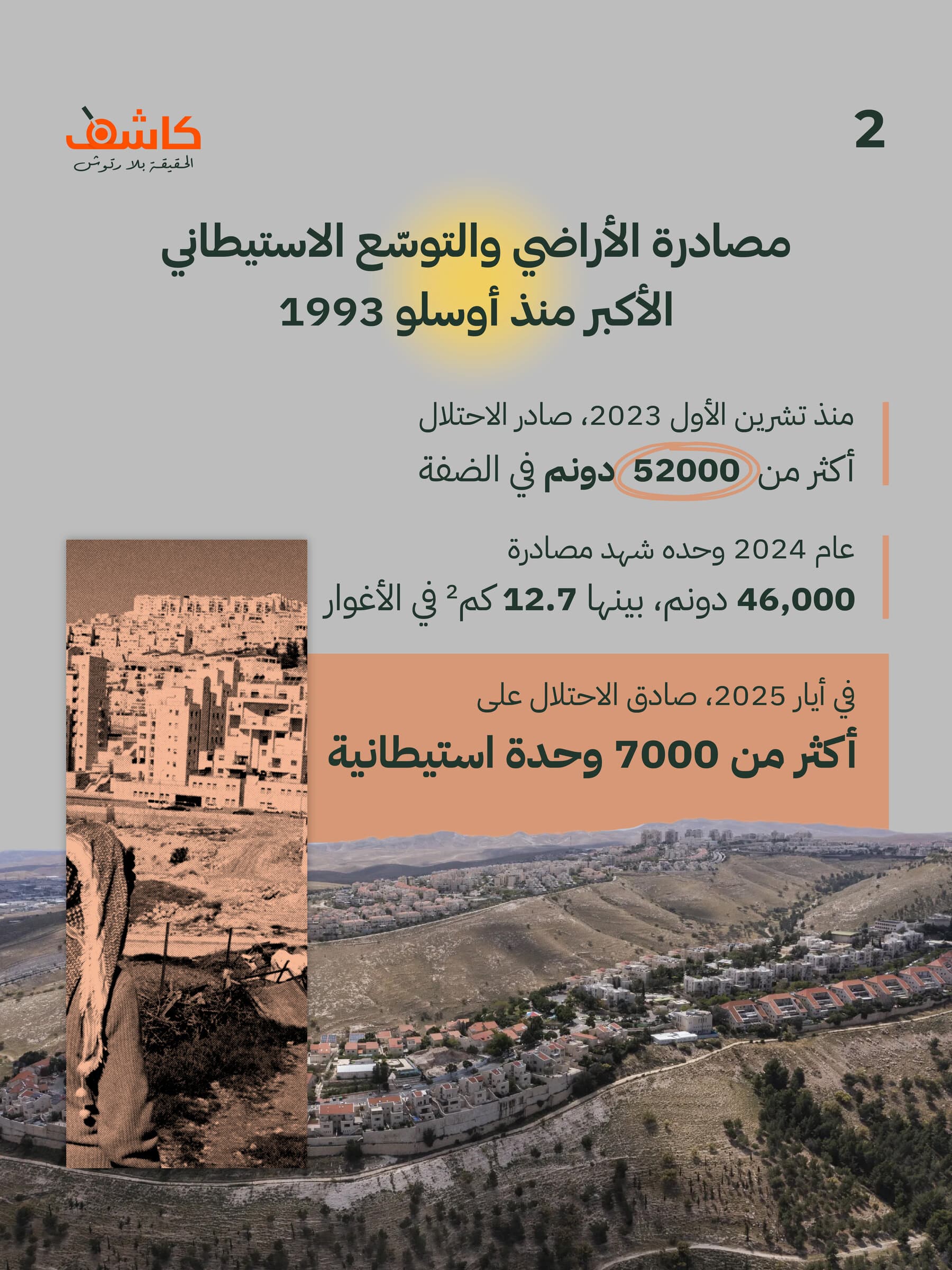
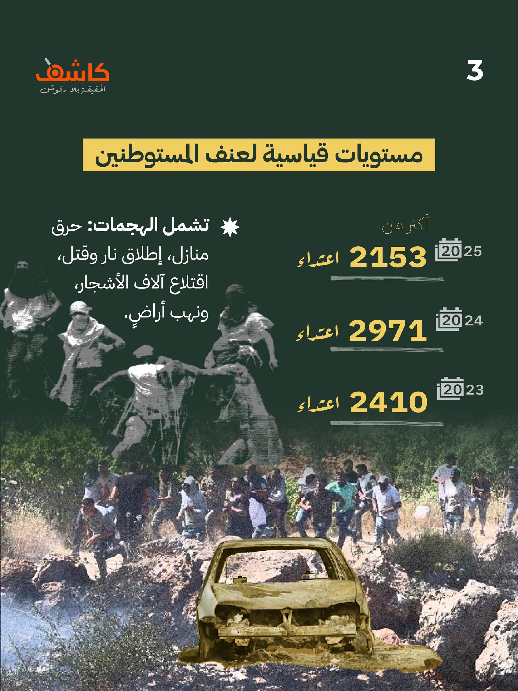
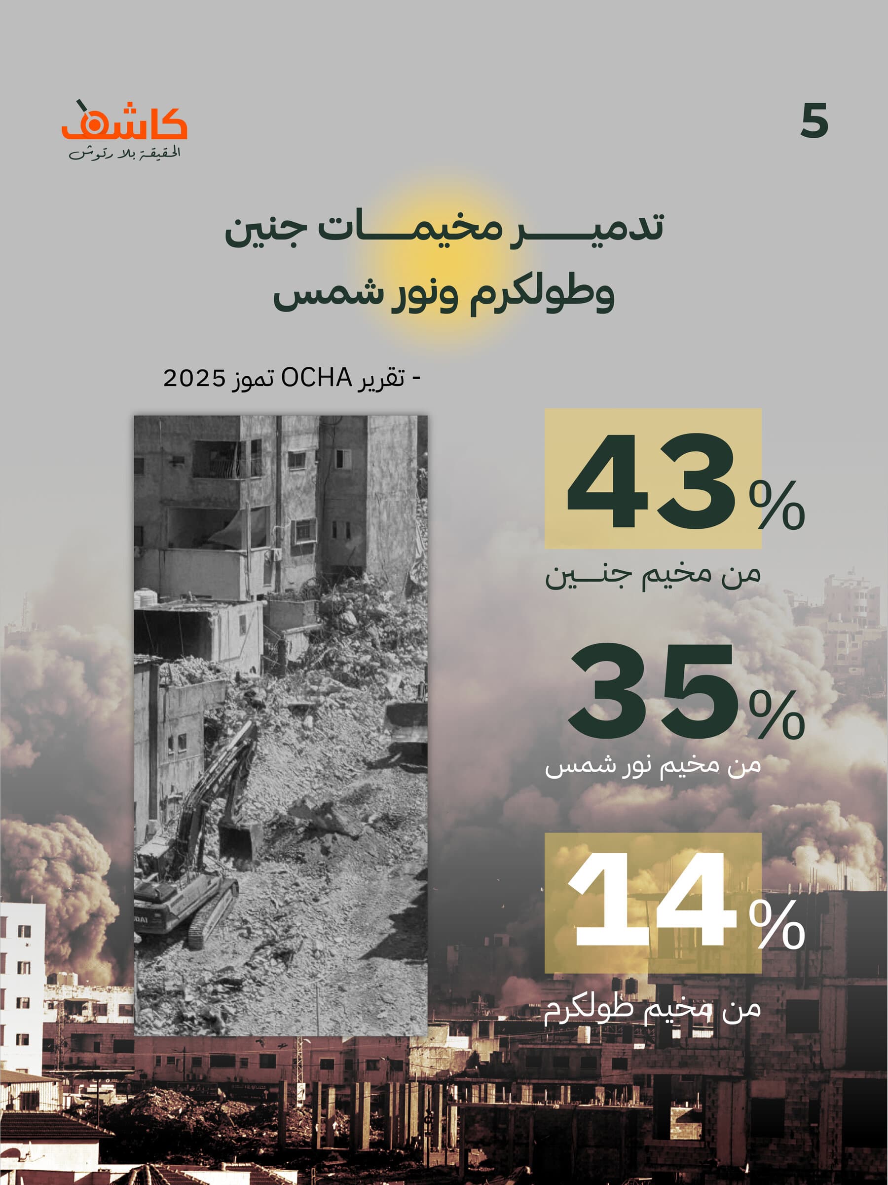
Scaling the System
The parts are fixed, so the account can move at the pace of the reporting: a new post is a headline band, a figure block and a photograph dropped into a frame that already exists. The same system carries a single post, a carousel and a story without a second set of rules.
Rights & Credits
Designed for Kashif. Photography and reported figures belong to Kashif and its sources; the work appears here for portfolio purposes only.
Conclusion
Business Impact
Kashif can publish without a design cycle in the way. The hierarchy, the four colours and the highlight device are settled, so a post is assembled from parts rather than laid out from nothing — and every one of them looks like it came from the same desk.
Reflection
The restraint was the work. Material this heavy invites treatment — texture, effects, a bigger palette — and every one of those would have made the posts look composed rather than reported. Holding to four steps and four colours kept the figures first, which is the only thing the account is for.
Satisfaction Meter
So... What's the plan?
Tell us where you're headed, and we'll help you get there!
Drop us an email!
info@eureka-creative.studioEureka Creative Studio 2026