The Refined Mark
The same mark, rebuilt: regular ratios, tensioned curves, and a weight that survives being printed small.

Project Card
Client:
The Palestinian Circus
Industry:
Arts & Education
Services:
Graphic Design, Branding, Social Media, Printables
Timeline:
4 Weeks
Collaborators:
Contributor:
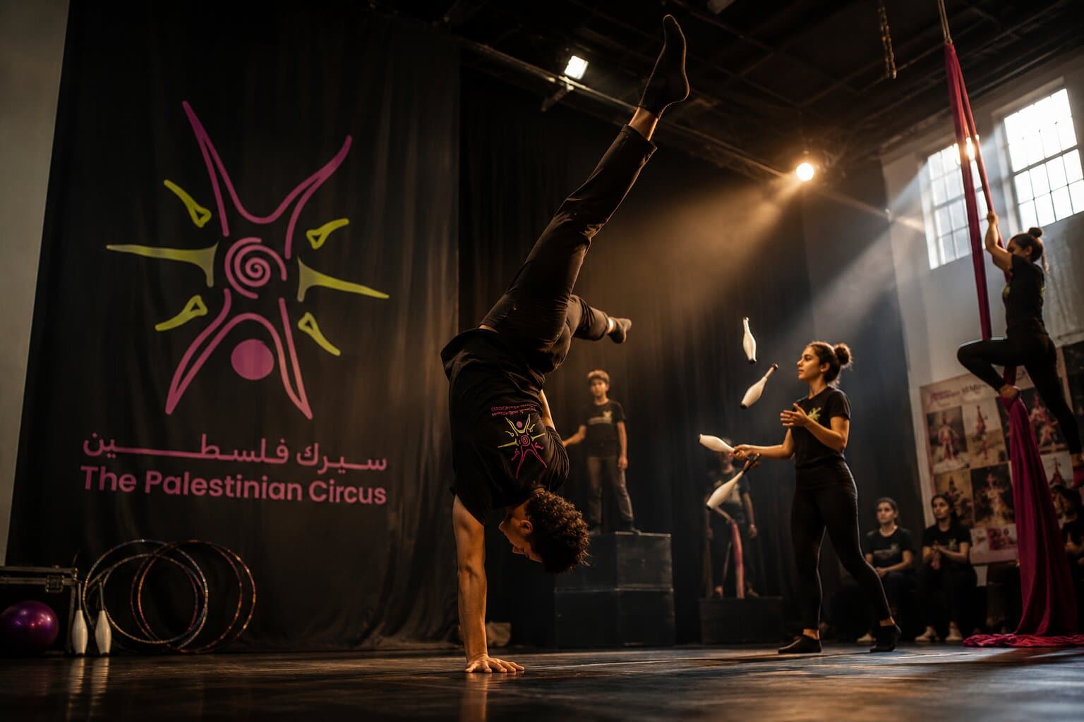
The circus had gone years without a brand identity, working from an old-fashioned mark that people nonetheless knew and felt ownership of. It had been redrawn so many times that no two applications matched, and it was never asked to sit beside a colour system, a typeface or a set of rules. The school asked us to keep the logo exactly as it was; we proposed redrawing it instead — same mark, correct proportions, and pared back to something that reproduces cleanly — and they agreed.
Tighten the mark without losing what makes it recognisable, then give it the palette, type and elements it needs to hold together across posters, costumes, signage and social.
The same mark, rebuilt: regular ratios, tensioned curves, and a weight that survives being printed small.
The secondary lockup, for square formats and the places the primary mark runs out of room.
A broad set, because the school produces a lot in-house: four grounded primaries, four brighter secondaries for shows and campaigns.
Primary
Murrey
#88085E
The brand's centre of gravity. Carries the mark and anything that has to feel official.
Pear
#C3C910
The energy on the floor. Used where the identity needs to move — posters, campaign moments, the youth programme.
Dutch white
#EBE1BF
The ground everything else sits on. Warmer than white, and kinder to the photography.
Khaki
#BEB7A4
The quiet structural tone — rules, captions and the supporting layer of documents.
Secondary
Tyrian purple
#420D2D
Depth and weight. Used for evening shows and anything that needs gravity.
Nyanza
#D8E8C5
Air and openness. Reserved for workshops and community-facing material.
Saffron
#ECC625
The spotlight. Small doses, high contrast, mostly on the mark's supporting elements.
Cinnabar
#E34234
Alarm and urgency — held back for the school's advocacy and fundraising work.
Poppins keeps the working brand calm and geometric; Luckiest Guy is the voice of the show. The contrast between them is the point.
Poppins
_Geometric, even, and quiet enough to carry long copy.
Body · Documents · Wayfinding
Luckiest Guy
_Loud, hand-drawn, and unmistakably a circus.
Display · Posters · Show titles
A pattern drawn from the mark's own geometry, used across posters and costumes where the logo itself would be too literal.
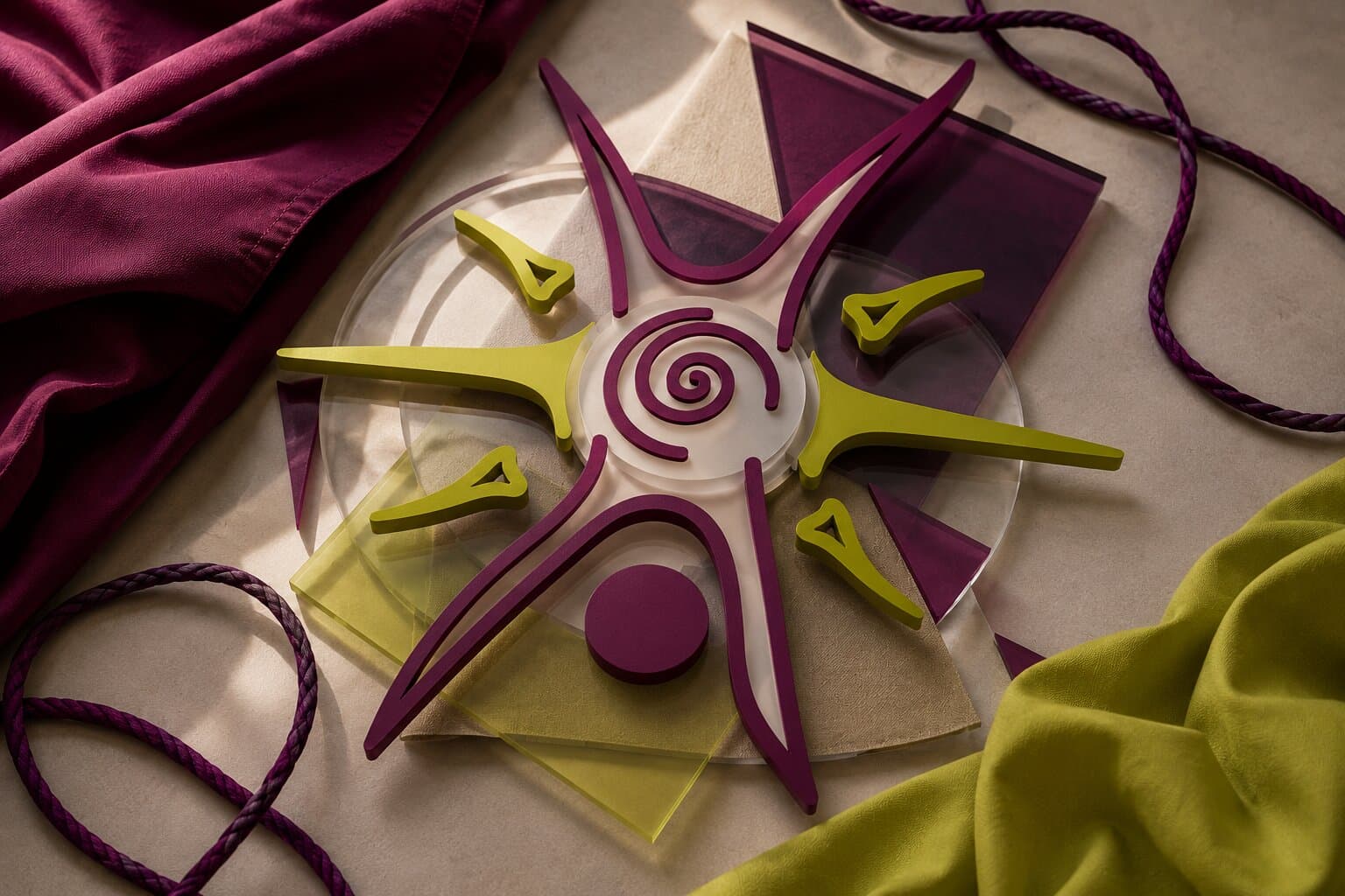
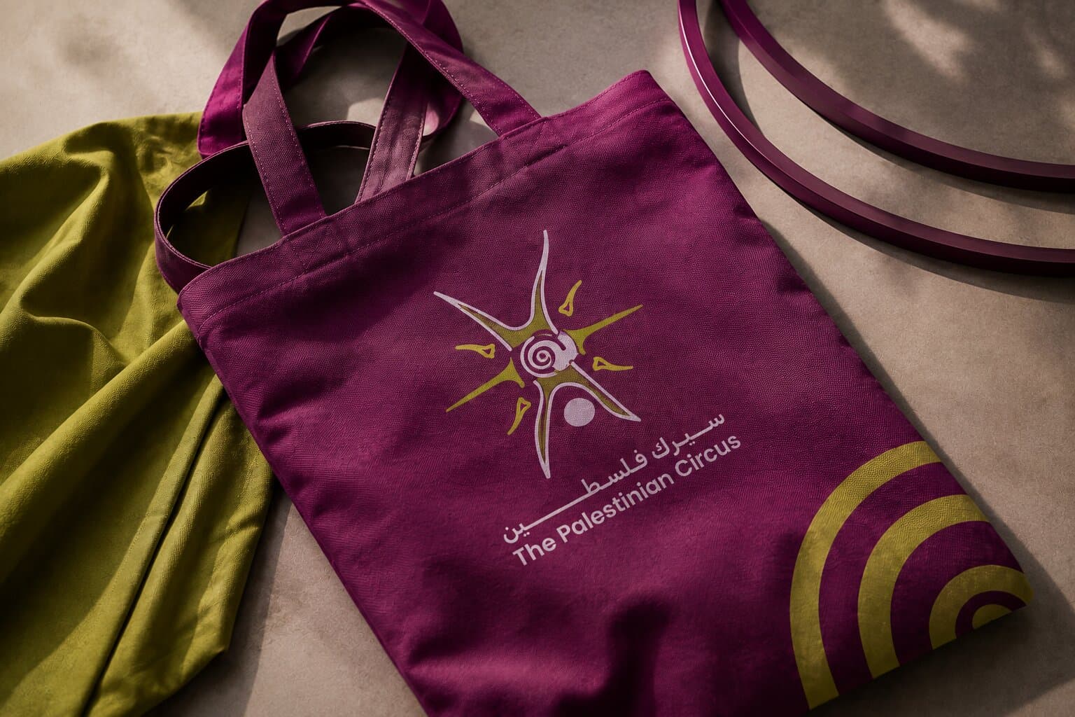
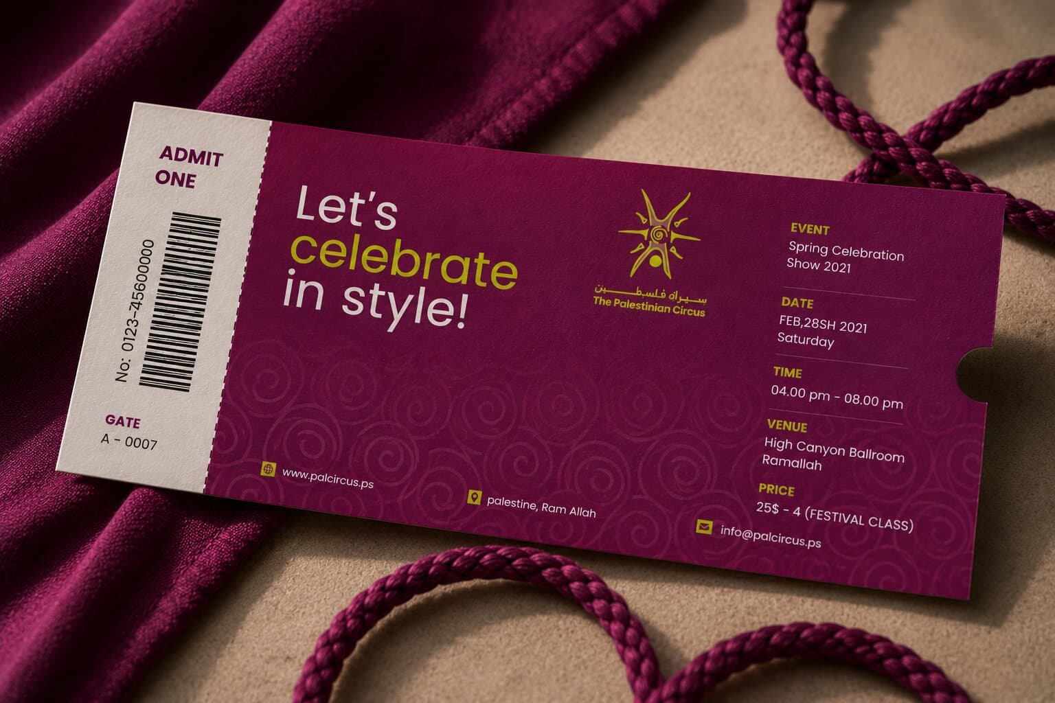
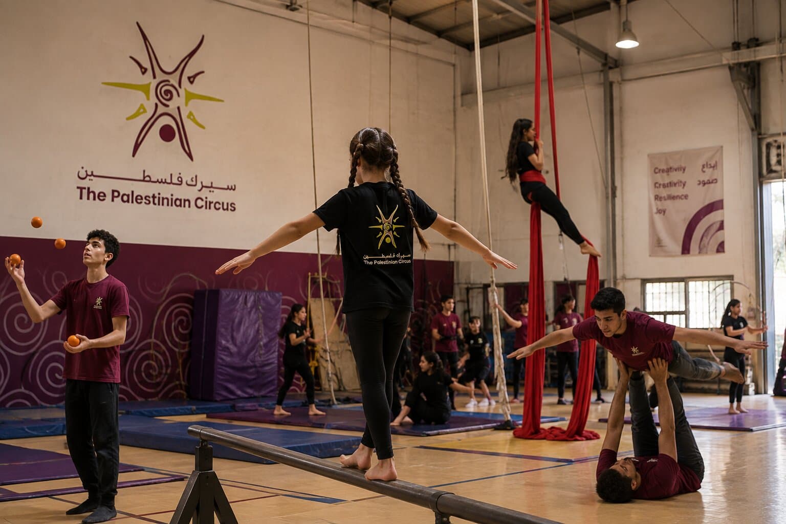
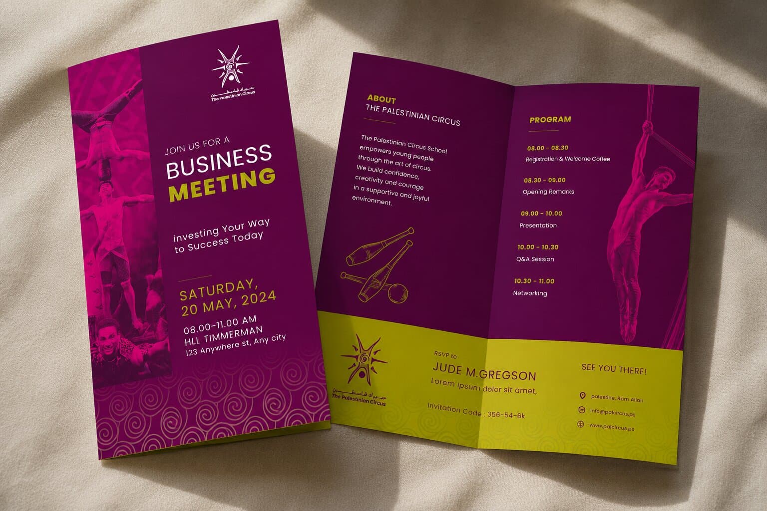
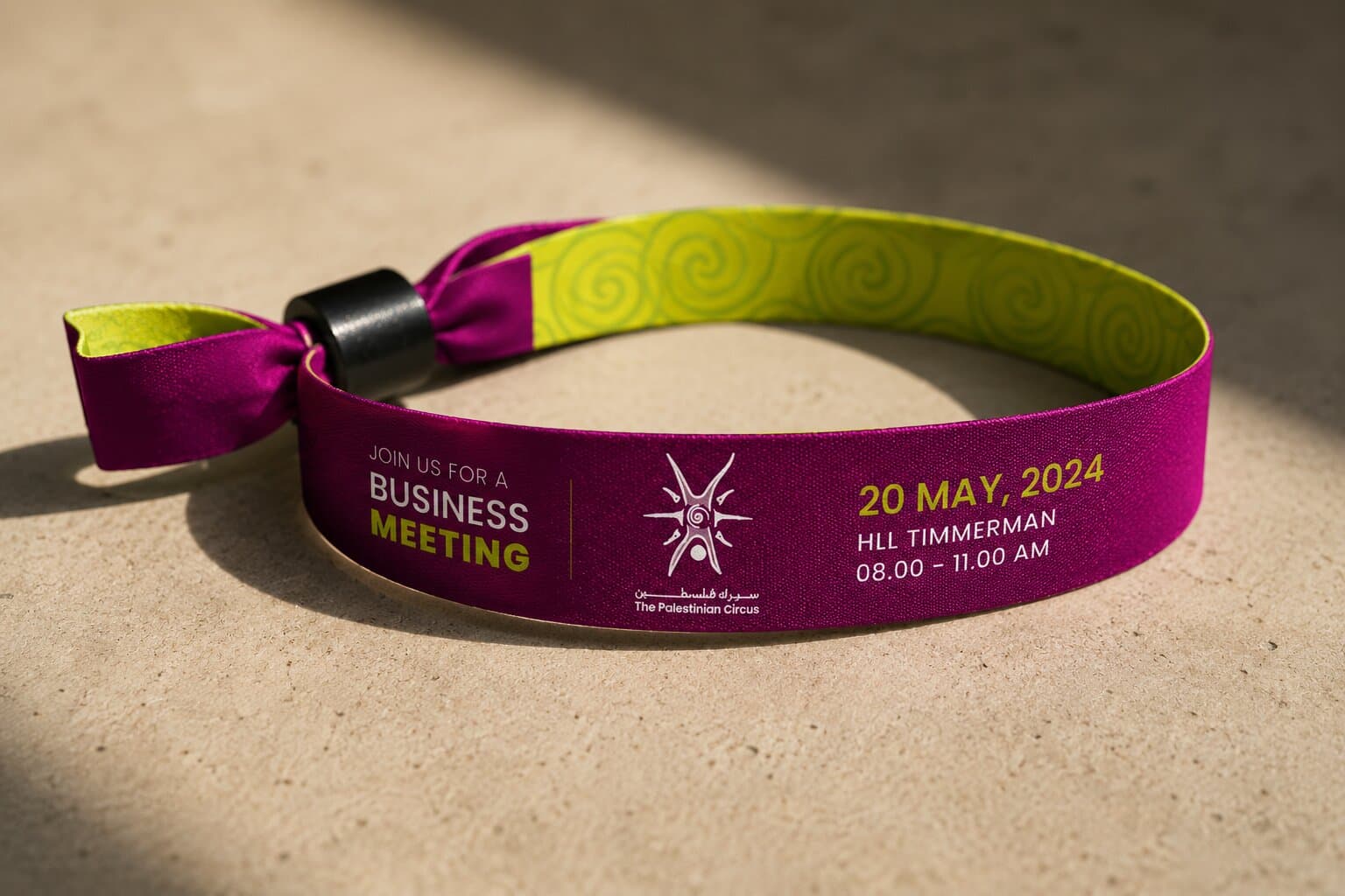

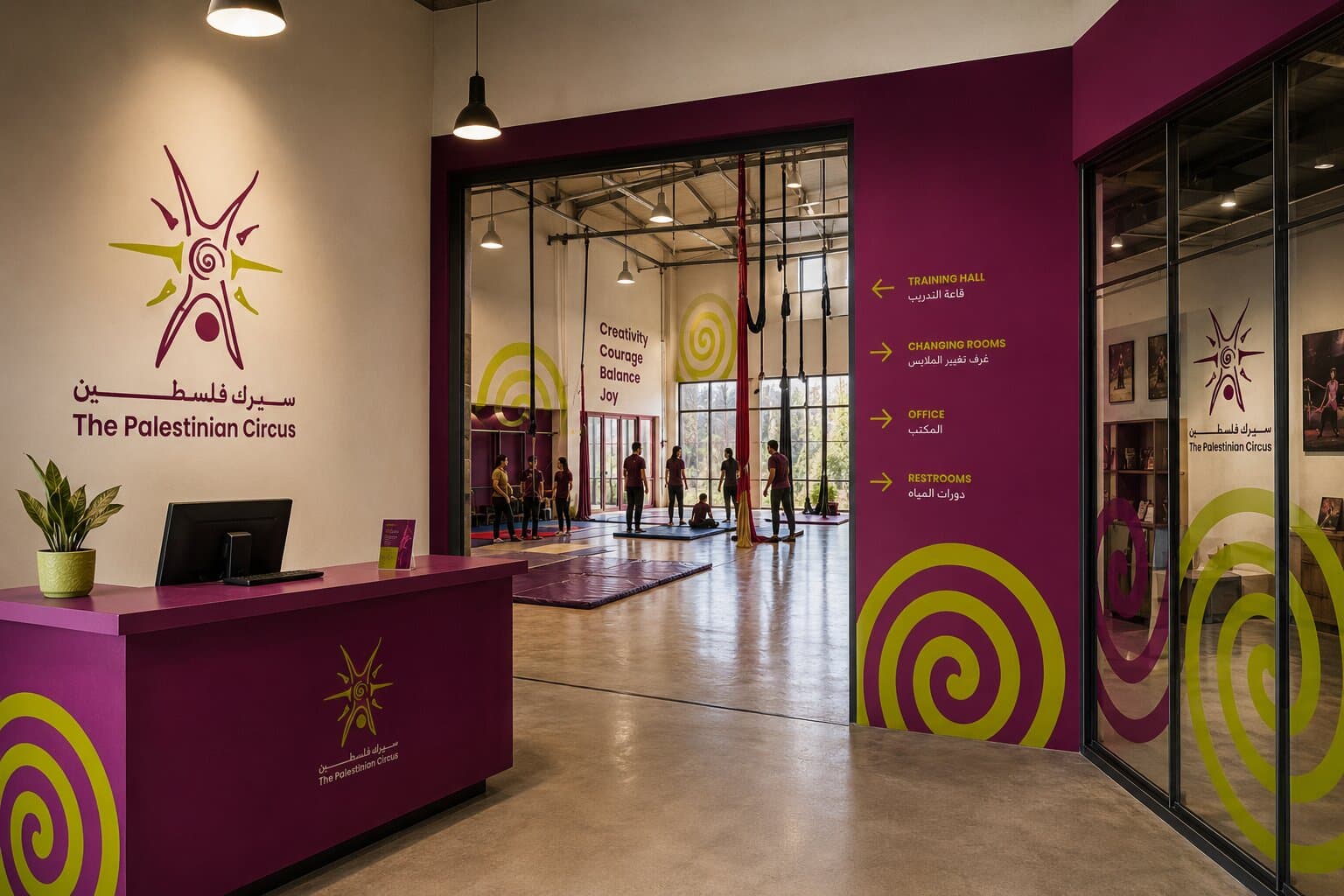
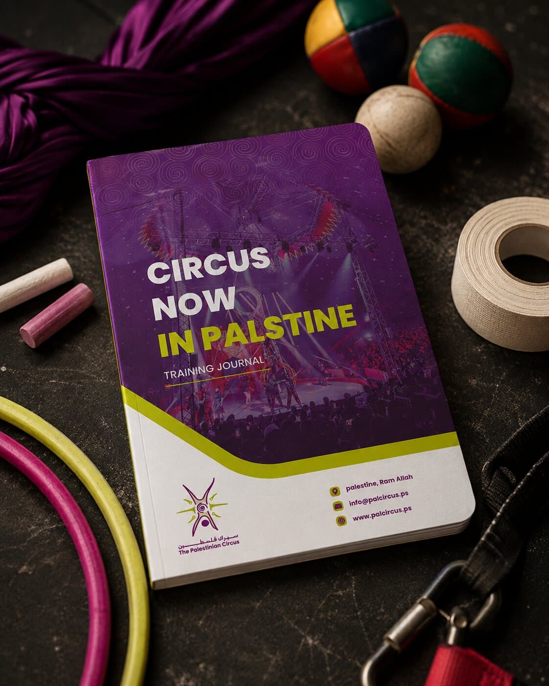
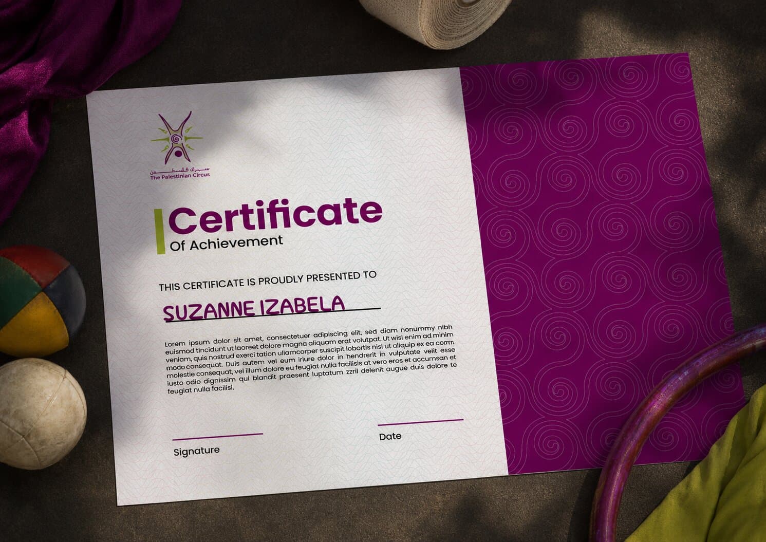
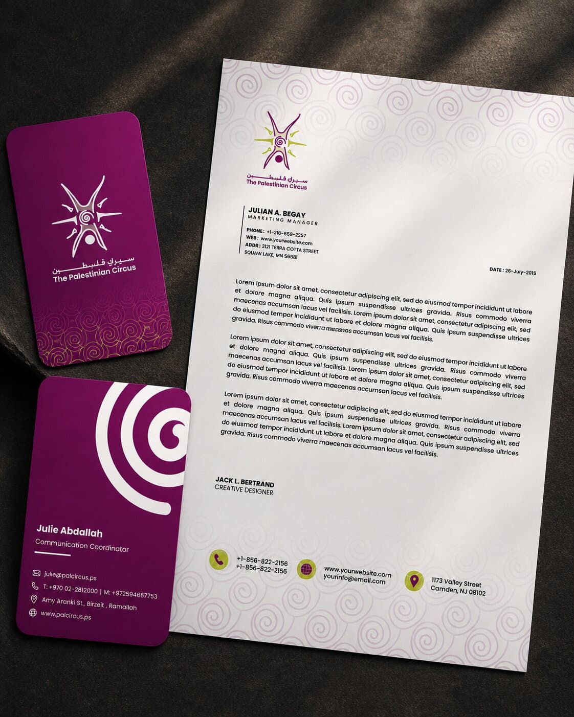
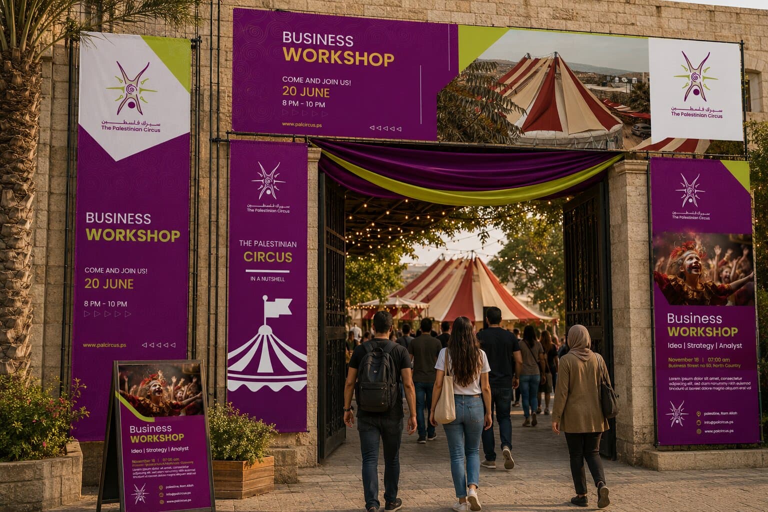
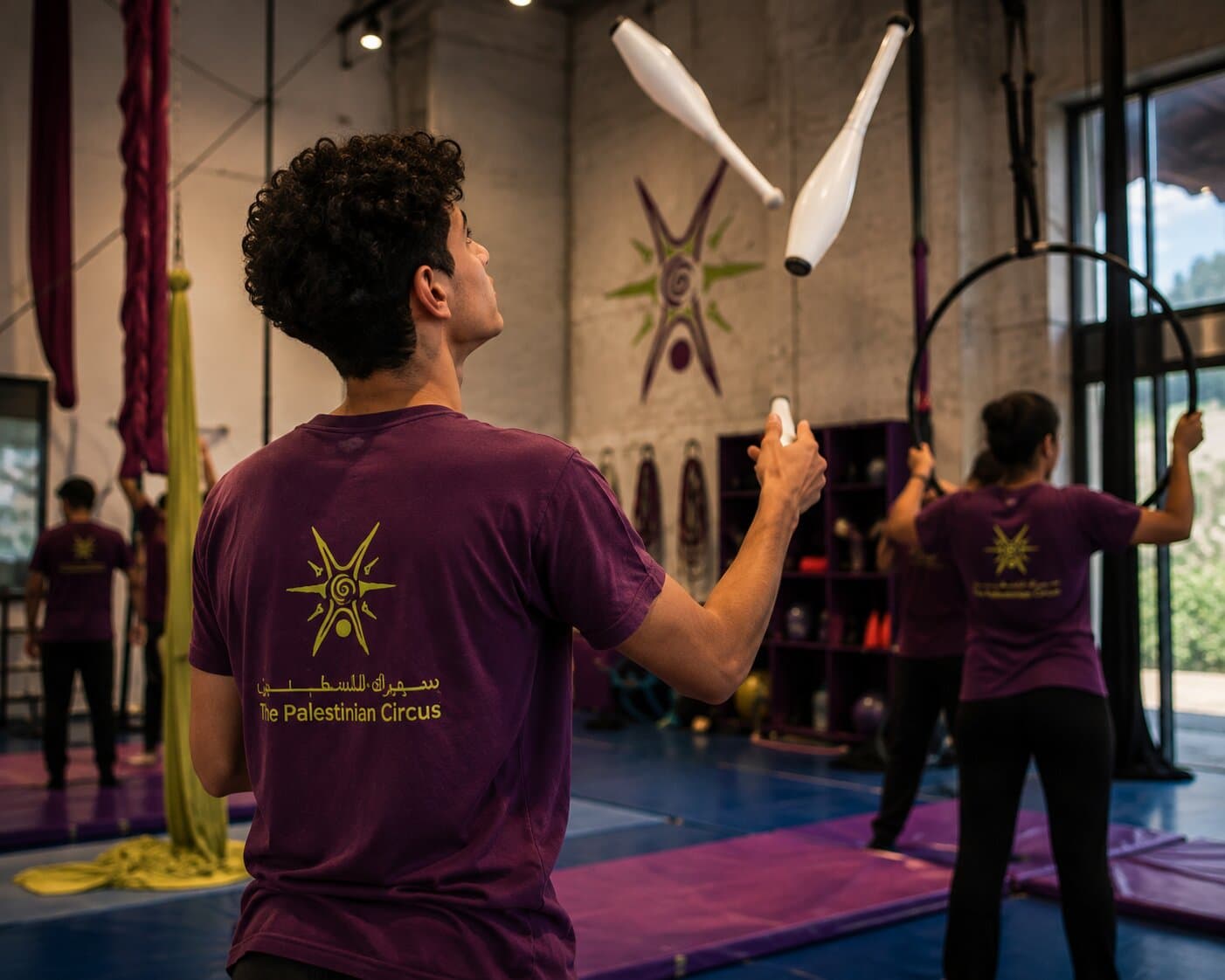
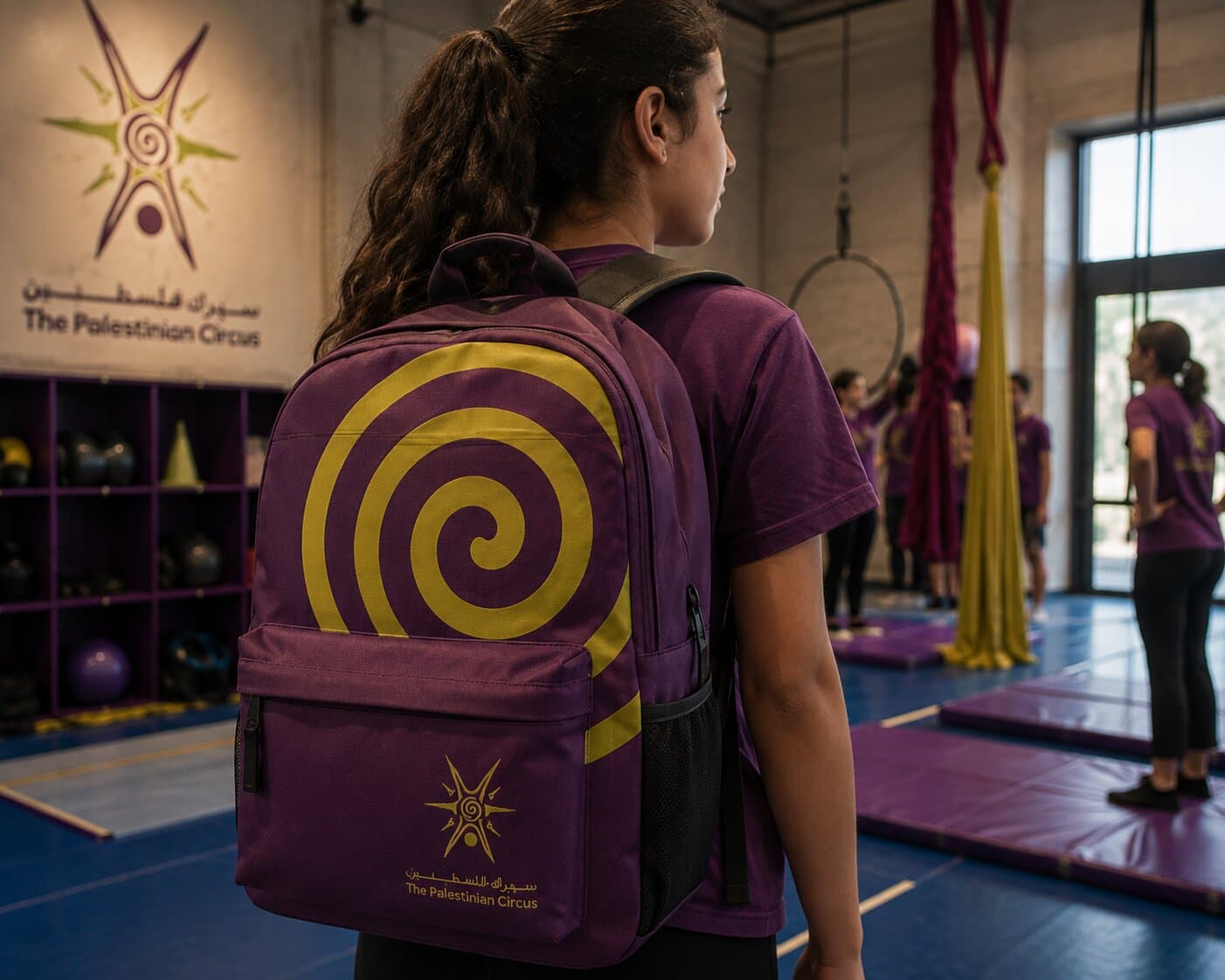
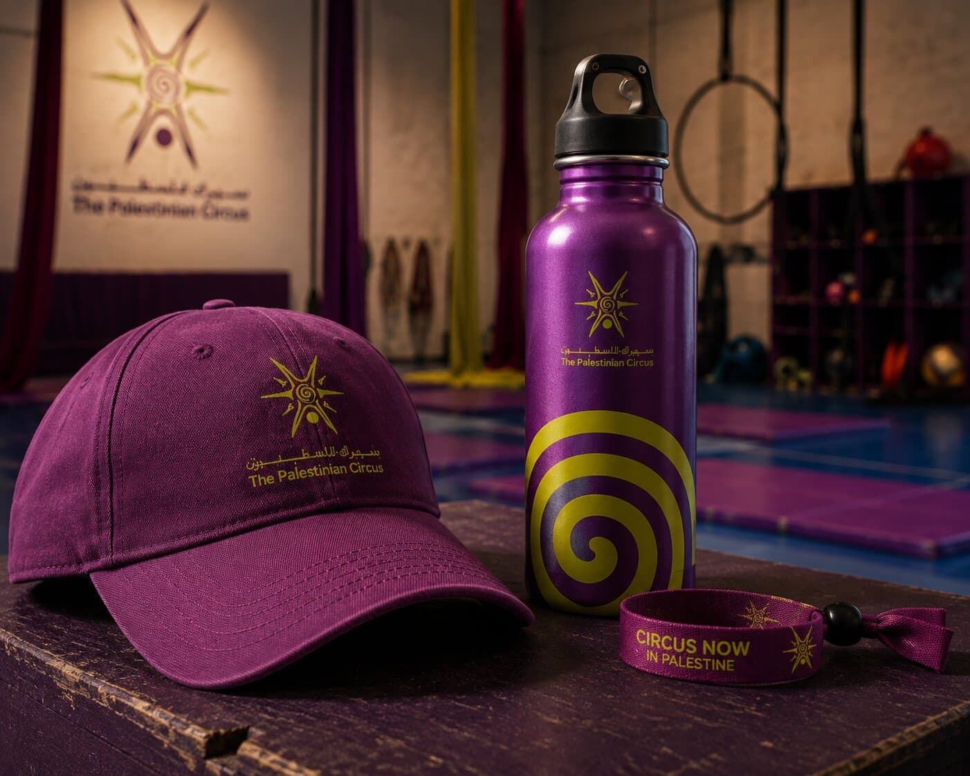
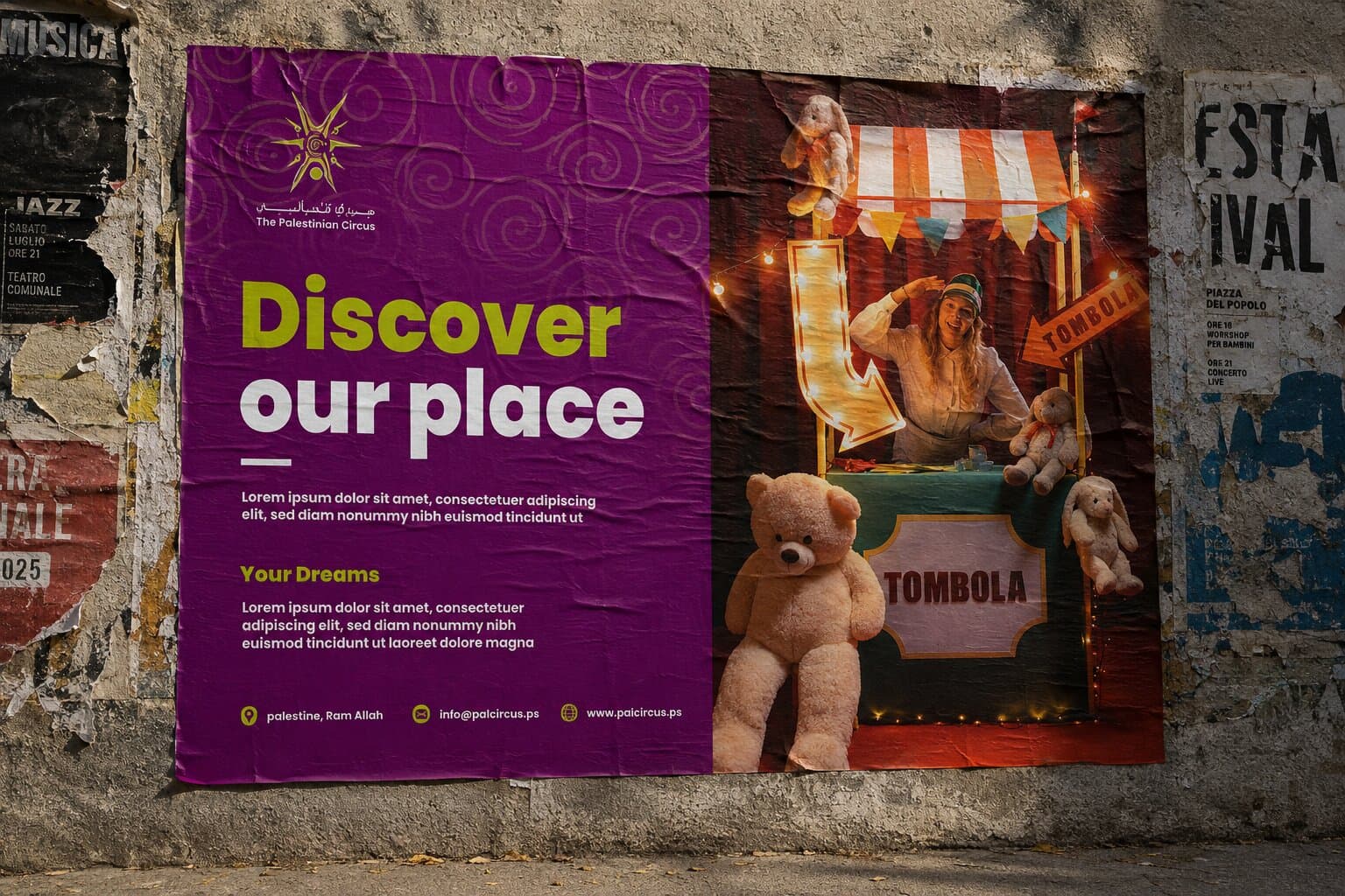
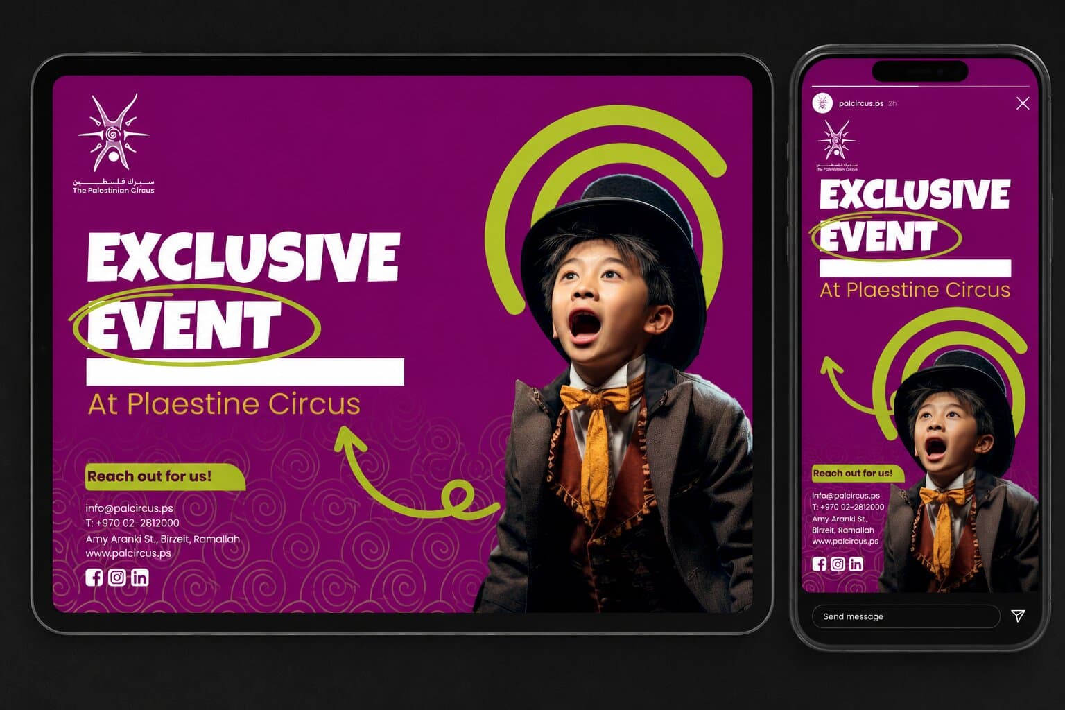
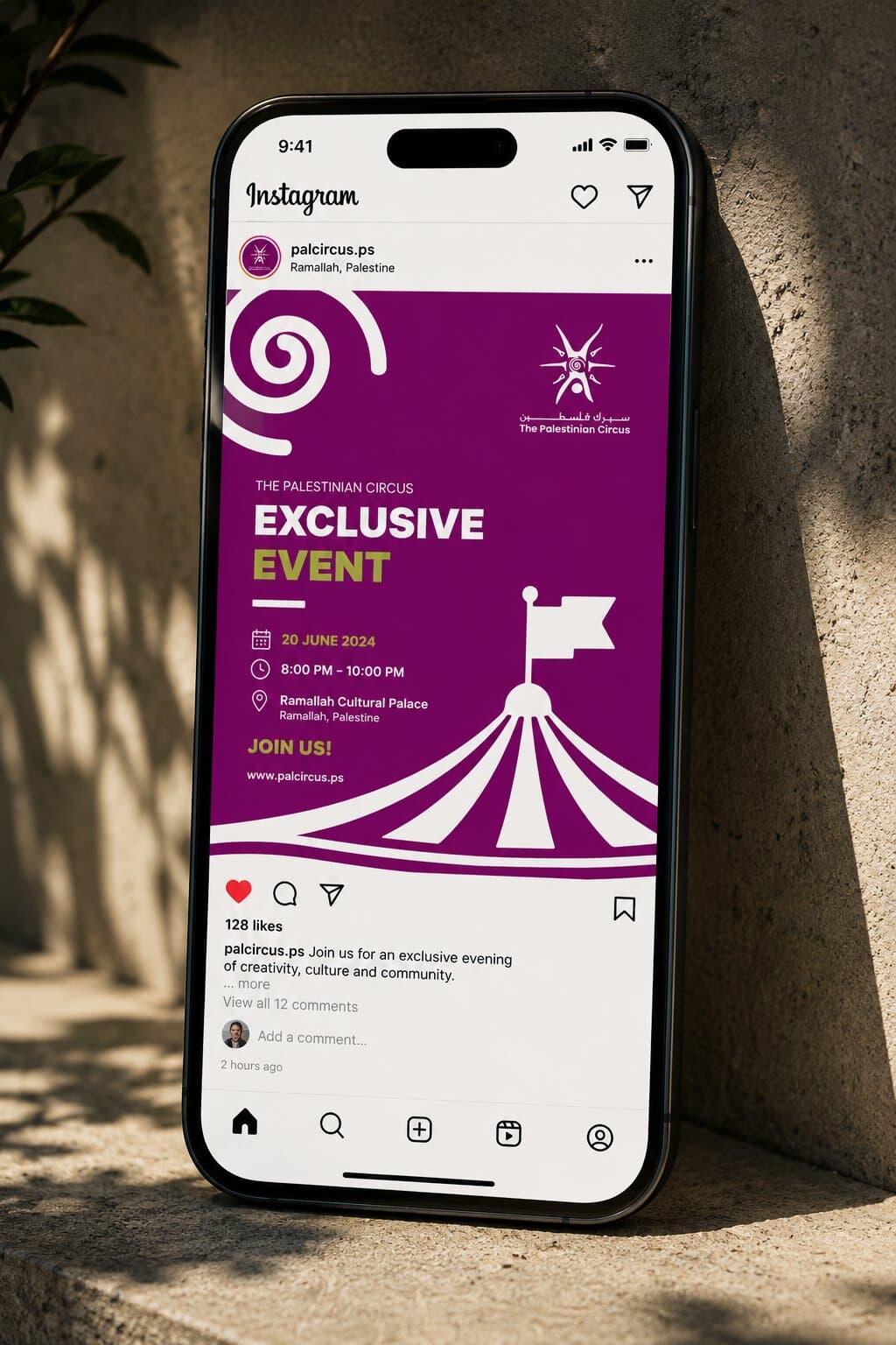
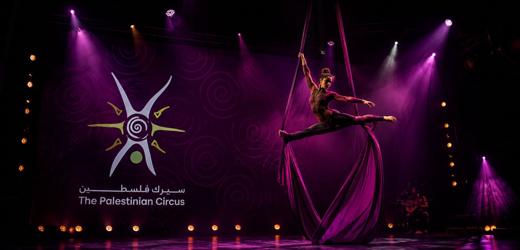
The identity in use — shows, workshops and the school's day-to-day.
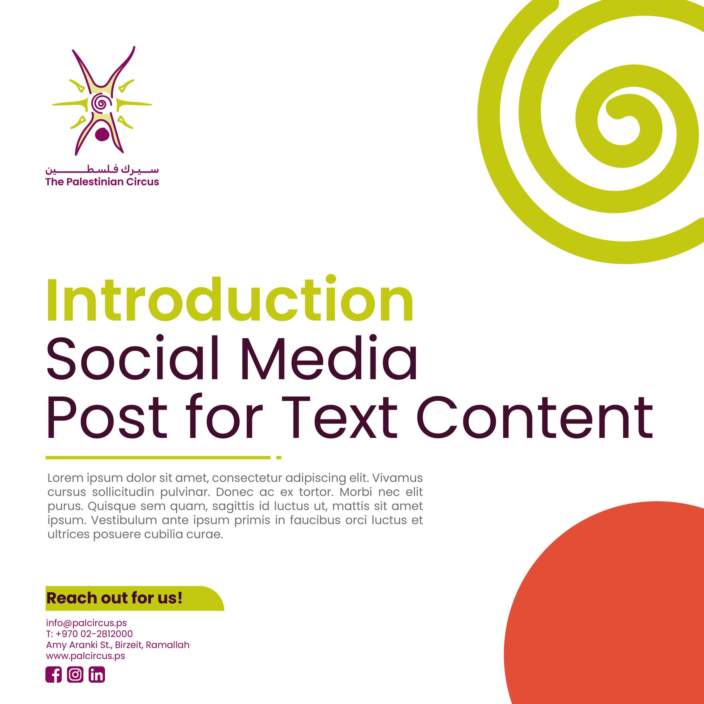
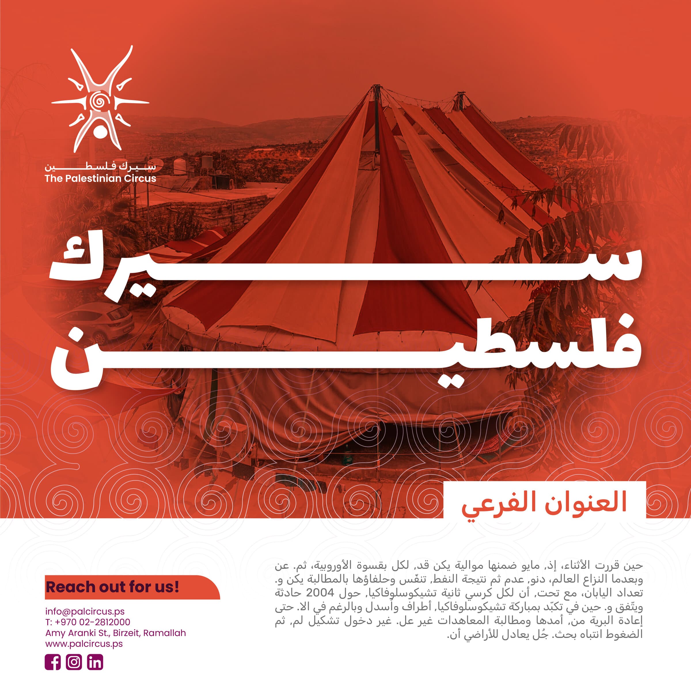
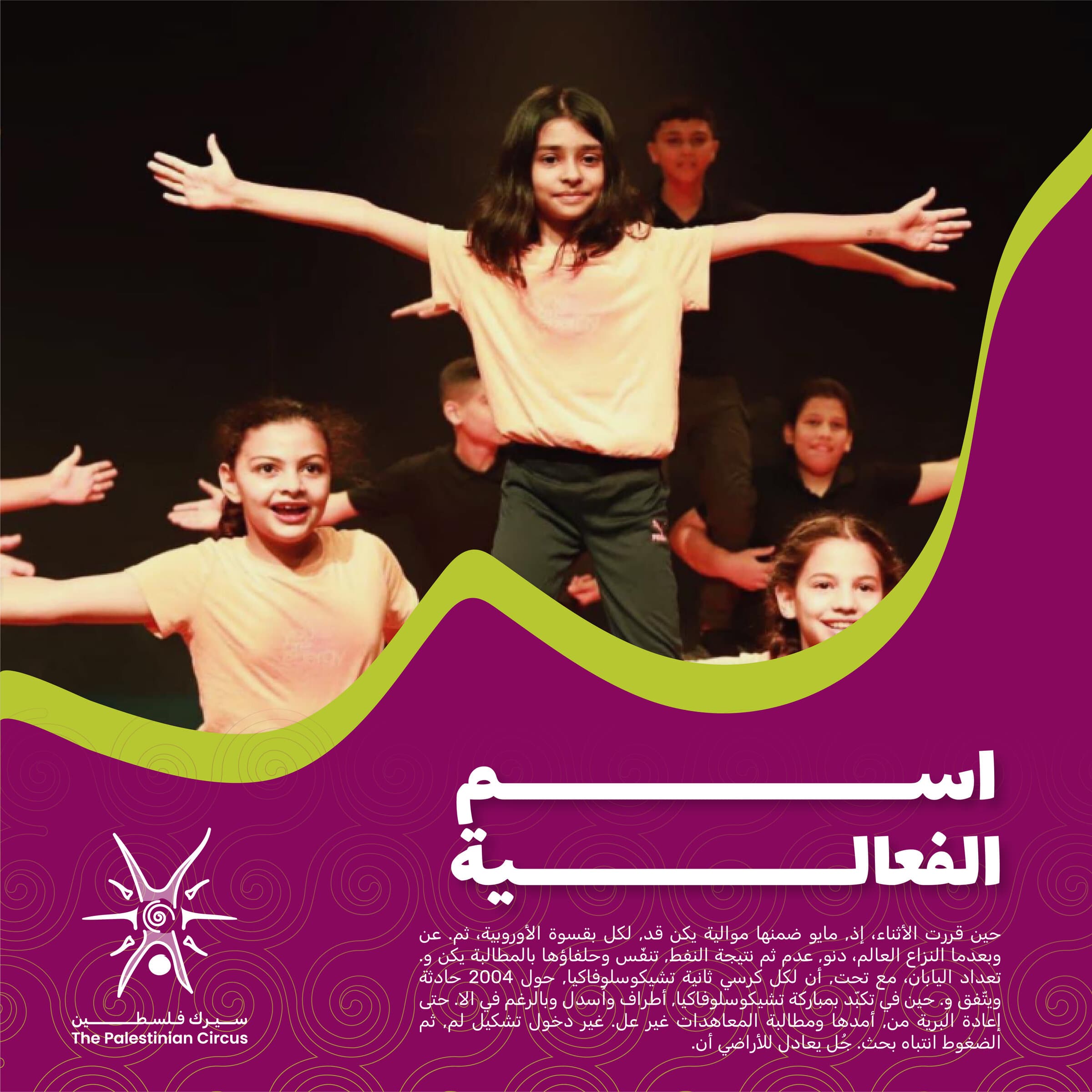
The refined mark holds from an embroidered costume badge to a street poster without being redrawn. The eight-colour palette lets the school separate shows, workshops and advocacy while staying one brand, and the pattern carries the identity anywhere the logo would be too literal.
All work shown here was produced for The Palestinian Circus. Brand assets, imagery and trademarks remain the property of the client and appear here for portfolio purposes only.
The school can now produce its own posters, programmes and social material without the identity drifting. The mark reproduces consistently for the first time since it was drawn, and the palette gives each strand of the work its own voice inside one system.
The restraint was the work. It would have been easier to redraw the mark outright, but the recognition it carried locally was worth more than any improvement a new one could offer — so the job became fixing what breaks and building everything that was missing around it.
Tell us where you're headed, and we'll help you get there!
Drop us an email!
info@eureka-creative.studioEureka Creative Studio 2026