
Project Card
Client:
SKINS+
Industry:
Medical Aesthetics
Services:
Social Media, Graphic Design
Timeline:
2 Weeks
Collaborators:
Challenge
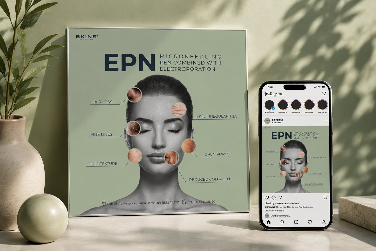
SKINS+ needed a digital presence that looked different from every other clinic feed, and minimal enough to actually say what they do. Medical aesthetics is sold on trust: the clinic offers procedures people are hesitant to ask about, so a feed has to be clinical enough to be believed and soft enough to be approached. The work had to give each treatment its own ground while the grid still reads as one clinic, and lead with the procedure rather than decorate around it.
Goals
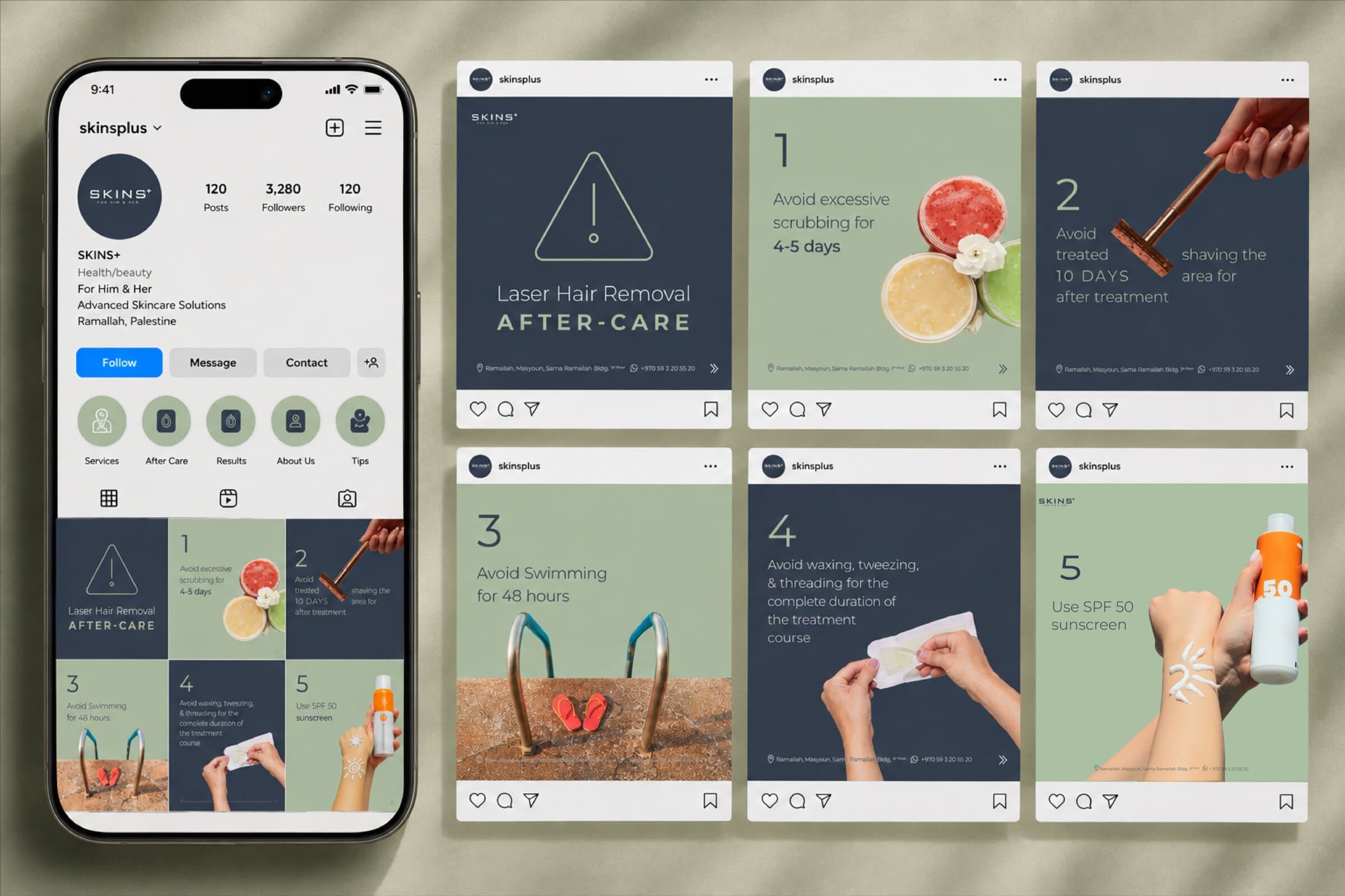
Give every treatment the same frame and let colour do the sorting: one ground per post, the procedure named large, the explanation in a second, quieter voice. Keep the medical detail legible at feed size, keep the clinic's address and number on every frame, and make the grid read as one account when you look at the profile rather than at a single post.
Creative Direction
Research
- Target Audience
- Women in and around Ramallah weighing up a treatment they have probably already searched for privately — informed enough to want specifics, cautious enough to be put off by a hard sell.
- Platform & Competitor Research
- Clinic feeds tend to split between clinical stock photography that reads cold and heavy retouching that reads untrustworthy. The accounts that convert explain the procedure plainly and look consistent from post to post.
- Key Insights
- The treatment name is the hook — people search for the procedure, not the clinic. Naming it first, large, does more than any amount of styling.
The Visual Language
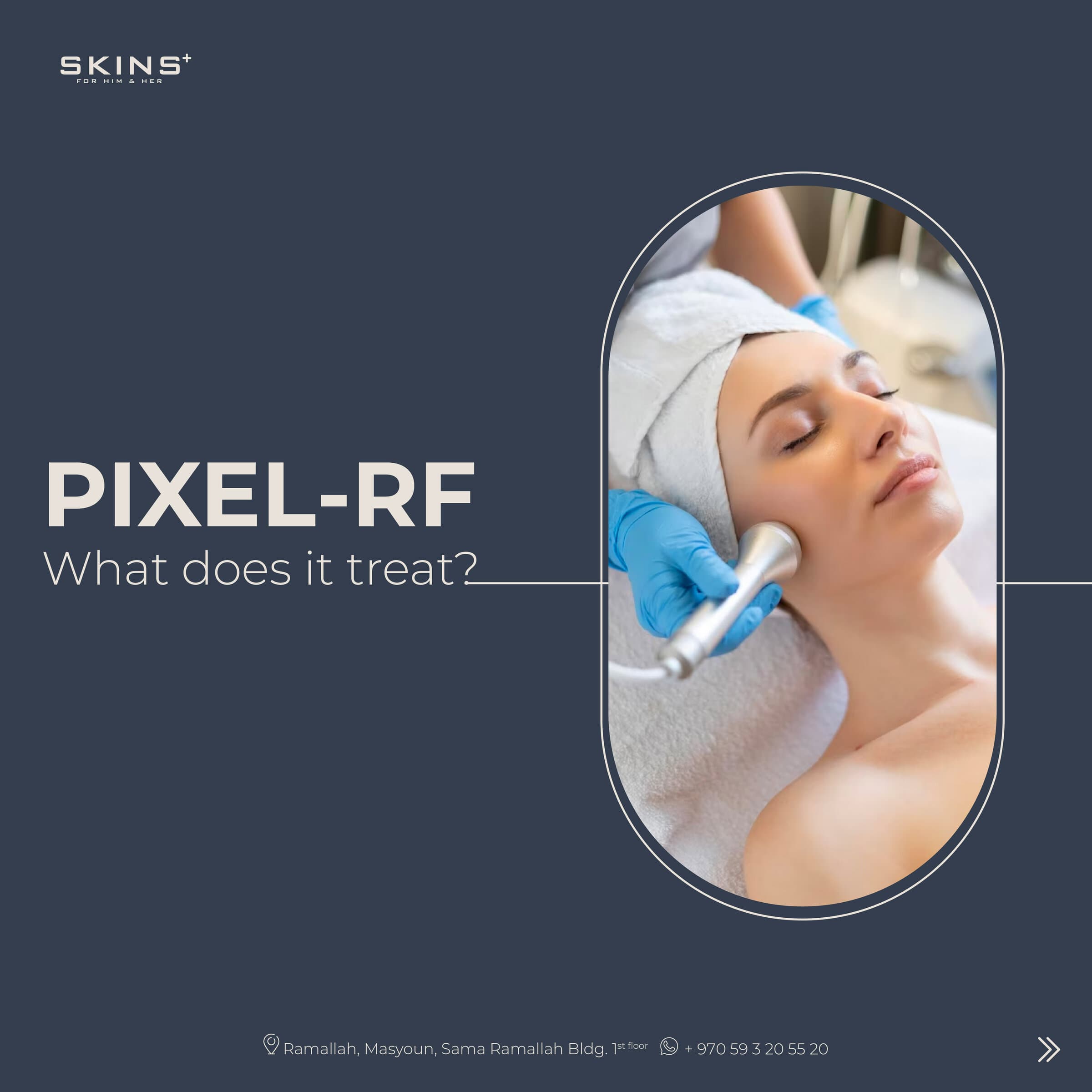
One frame, four grounds and a plain-spoken hierarchy — so a new treatment is a colour and two lines rather than a new design.
Colors
A ground per treatment, muted enough to let clinical photography sit on it.
Typography
The procedure first, the explanation second.
Treatment
Botox
Qualifier
For Hyperhidrosis
Detail
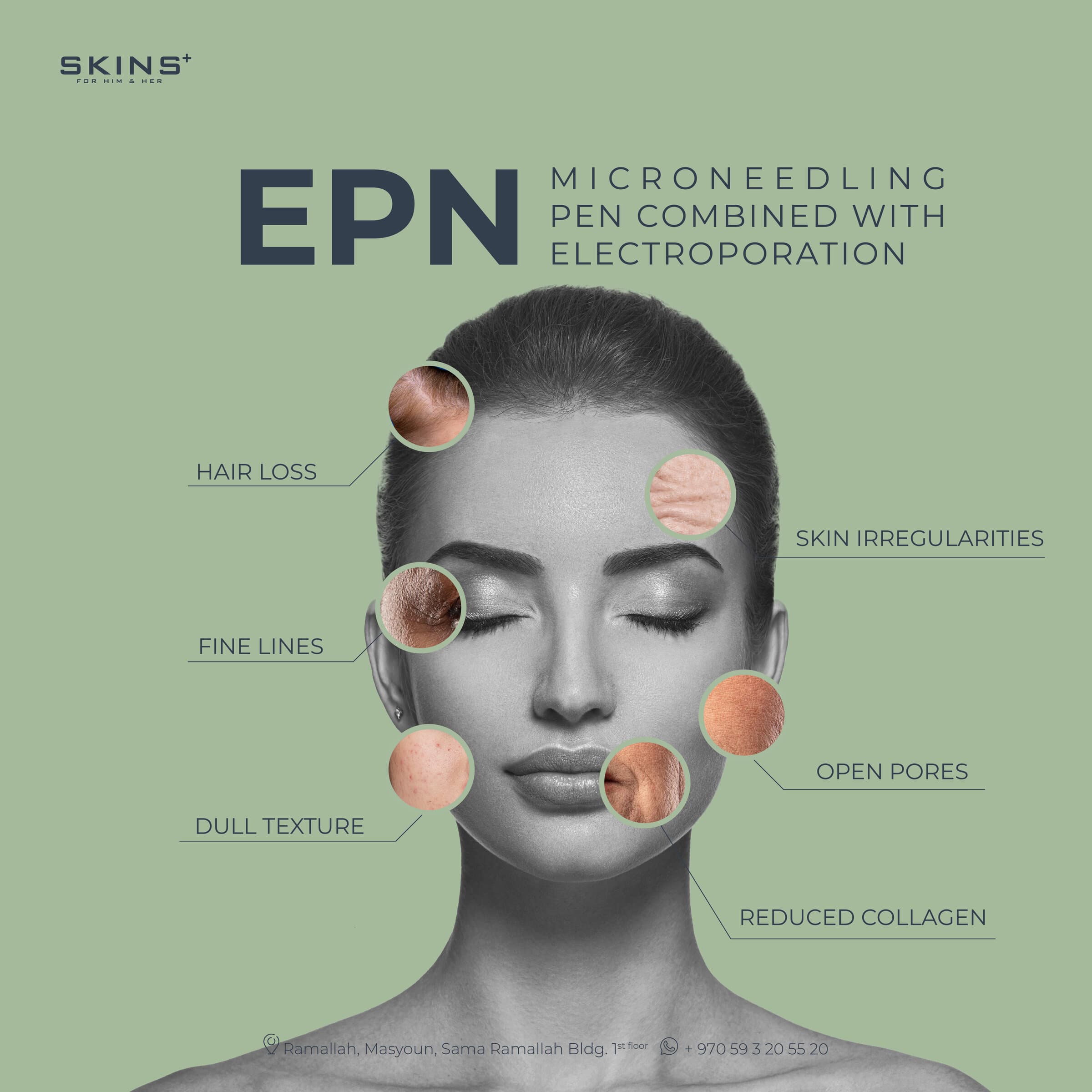
Microneedling pen combined with electroporation
Label
Open pores
Graphic Elements
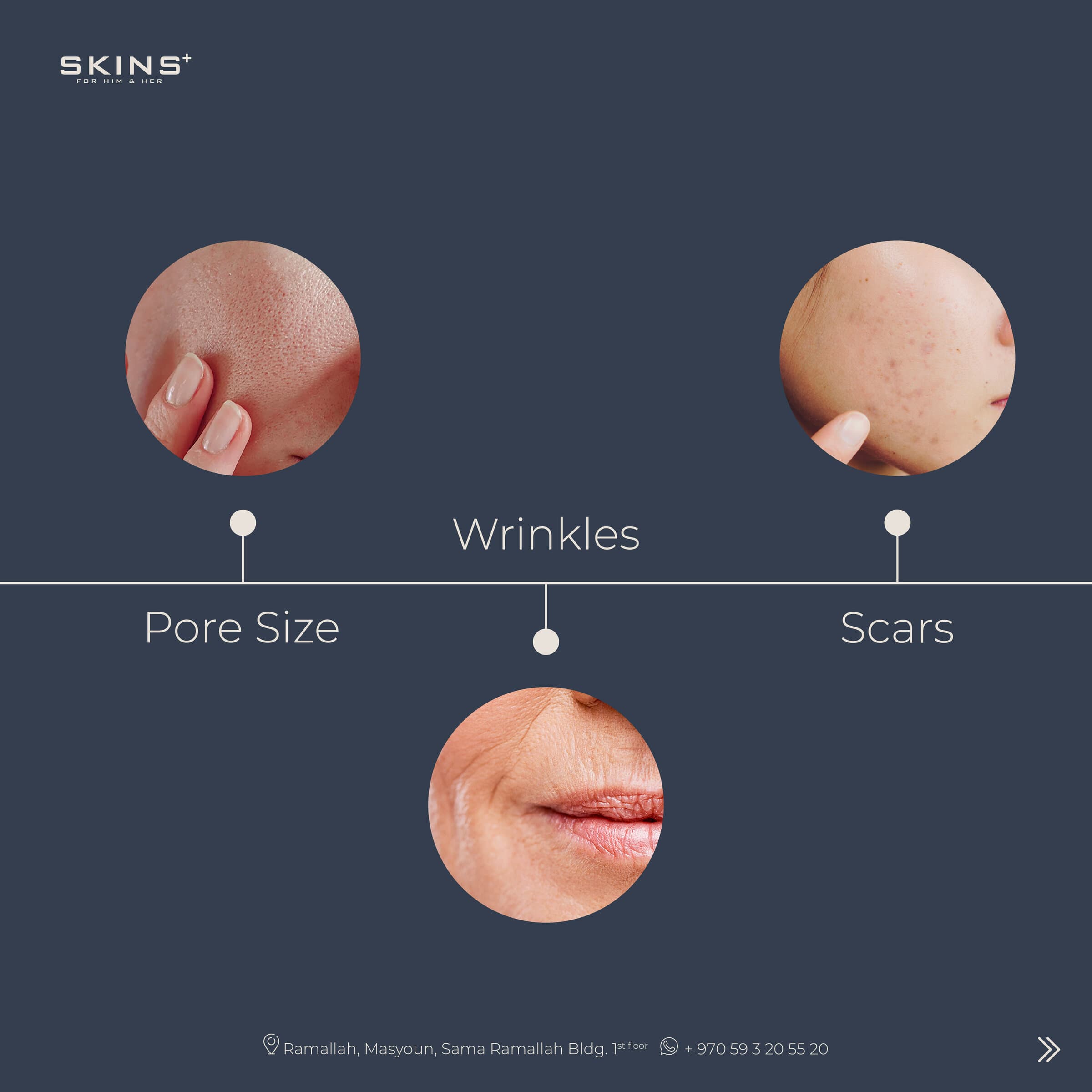
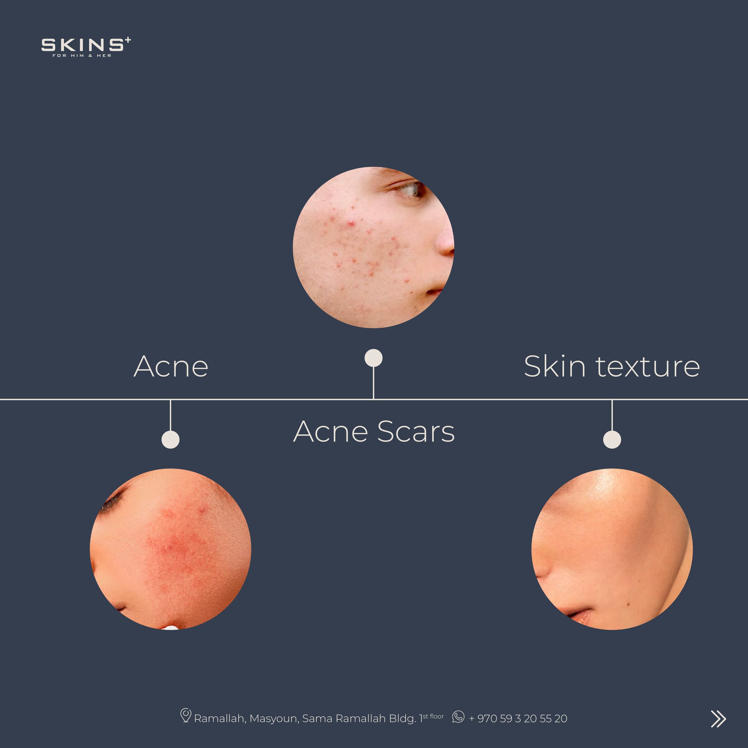
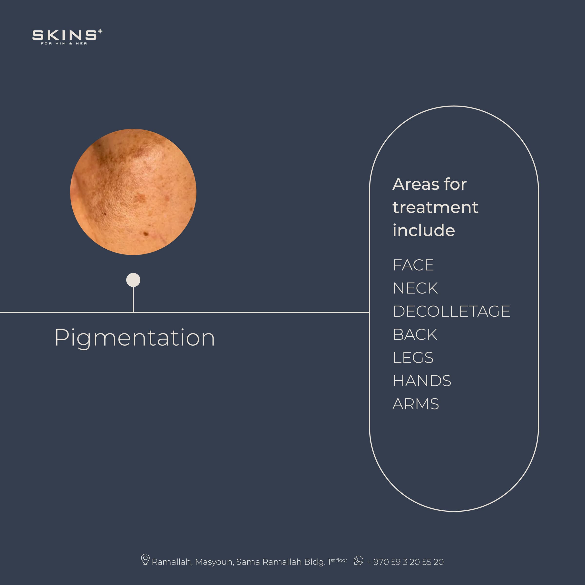
Portraits desaturated to a single tone and set on the treatment's ground, plus the leader lines that label what a procedure addresses and the footer bar carrying the address on every frame.




Scaling the System
The frame does not change, so the account scales by adding grounds rather than layouts. A new treatment is a colour, a photograph and two lines; a carousel is the same frame repeated with the explanation split across slides. The clinic can post a service the week it launches without waiting on design.
Rights & Credits
Designed for SKINS+, Ramallah. Clinical photography and treatment information belong to the clinic; the work appears here for portfolio purposes only.
Conclusion
Business Impact
SKINS+ has a grid that reads as one clinic and a frame that can absorb any treatment. Naming the procedure first means posts answer the question people are actually searching, and the footer bar puts the address and number on every frame that gets shared — so a saved post is still useful a month later.
Reflection
The colour system turned out to be the whole idea. Giving each treatment its own ground solved the two problems at once: it keeps a profile grid legible as a set of services, and it lets honest clinical photography sit on the page without the retouching this category usually reaches for. Everything else — one type hierarchy, one footer, one mark position — exists to stay out of its way.
Satisfaction Meter
So... What's the plan?
Tell us where you're headed, and we'll help you get there!
Drop us an email!
info@eureka-creative.studioEureka Creative Studio 2026