
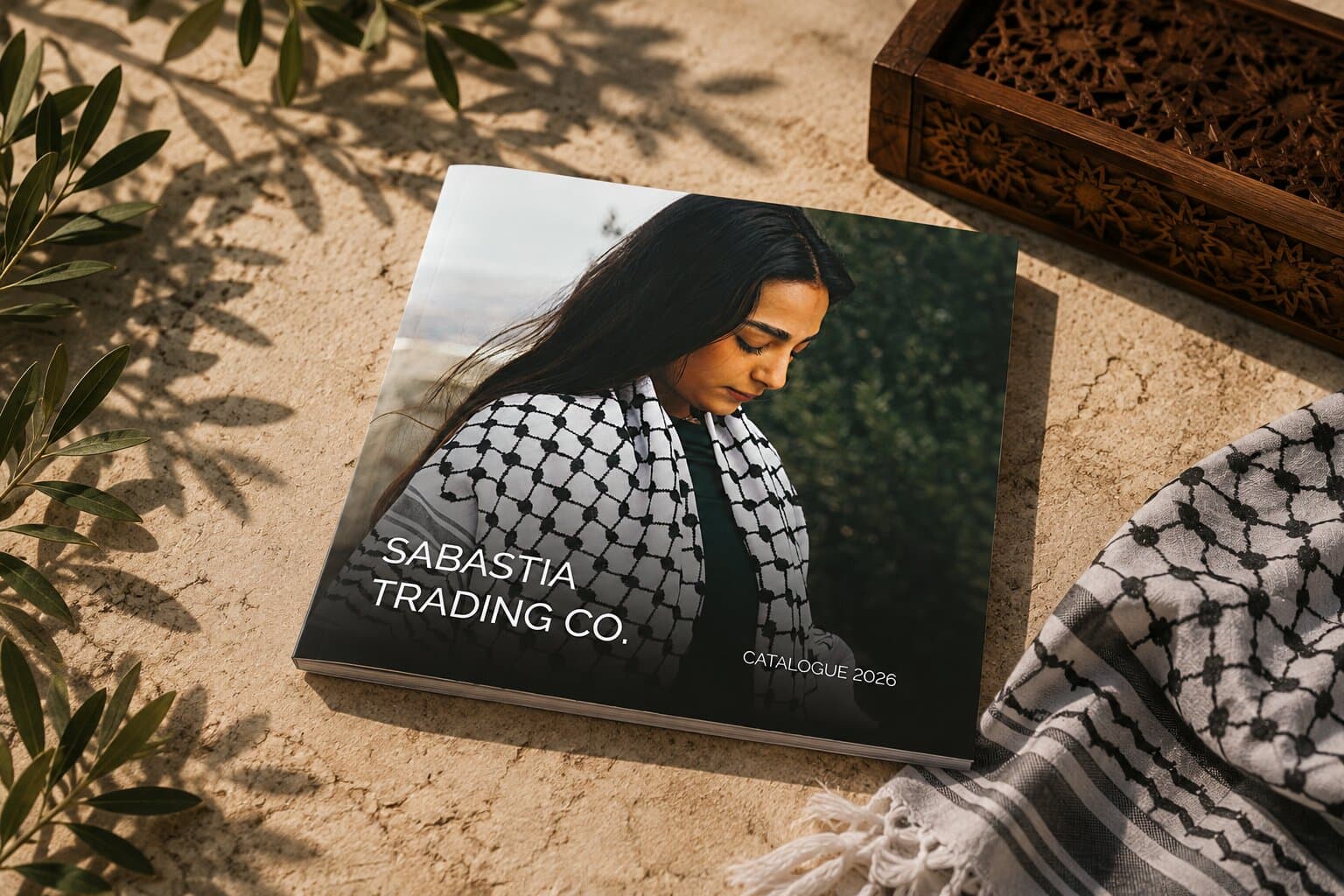
Project Card
Client:
Sabastia Trading Co.
Industry:
Palestinian Textiles
Services:
Publication, Editorial
Timeline:
3 Weeks
Collaborators:
Challenge
Sabastia wanted a catchy catalogue that puts the product first and talks as little as possible. A kuffiyeh photographs beautifully and describes badly — the differences between one and the next are in the weave, the border and the colour, none of which survive a paragraph. So the design had to carry the range on the photography and the sequence, with copy reduced to what a buyer actually needs, and still let someone find a specific piece without reading the book.
Goals
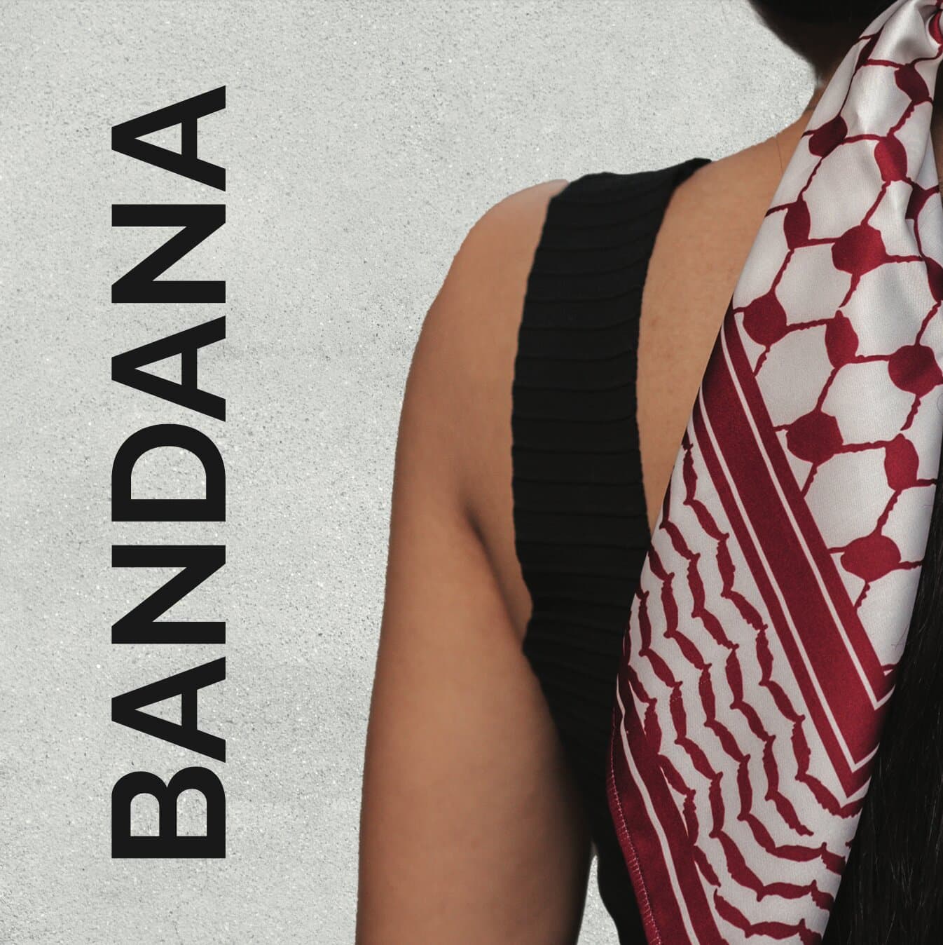
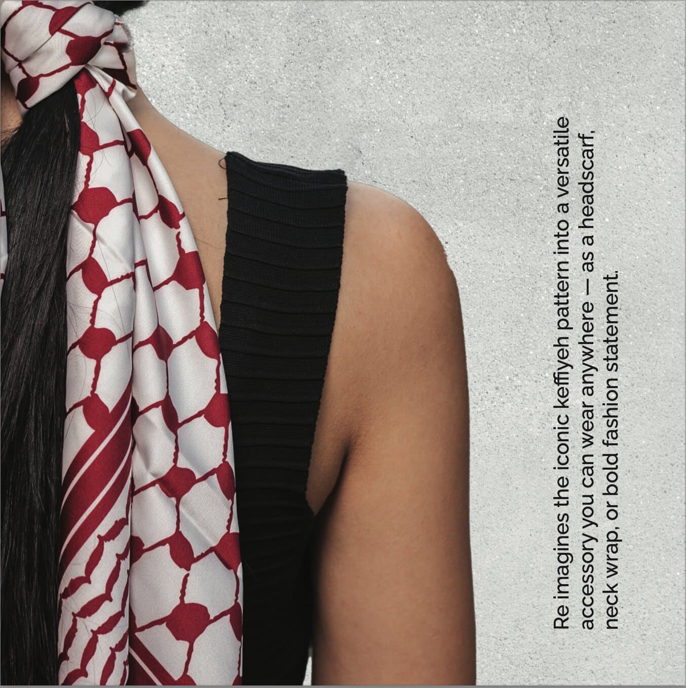
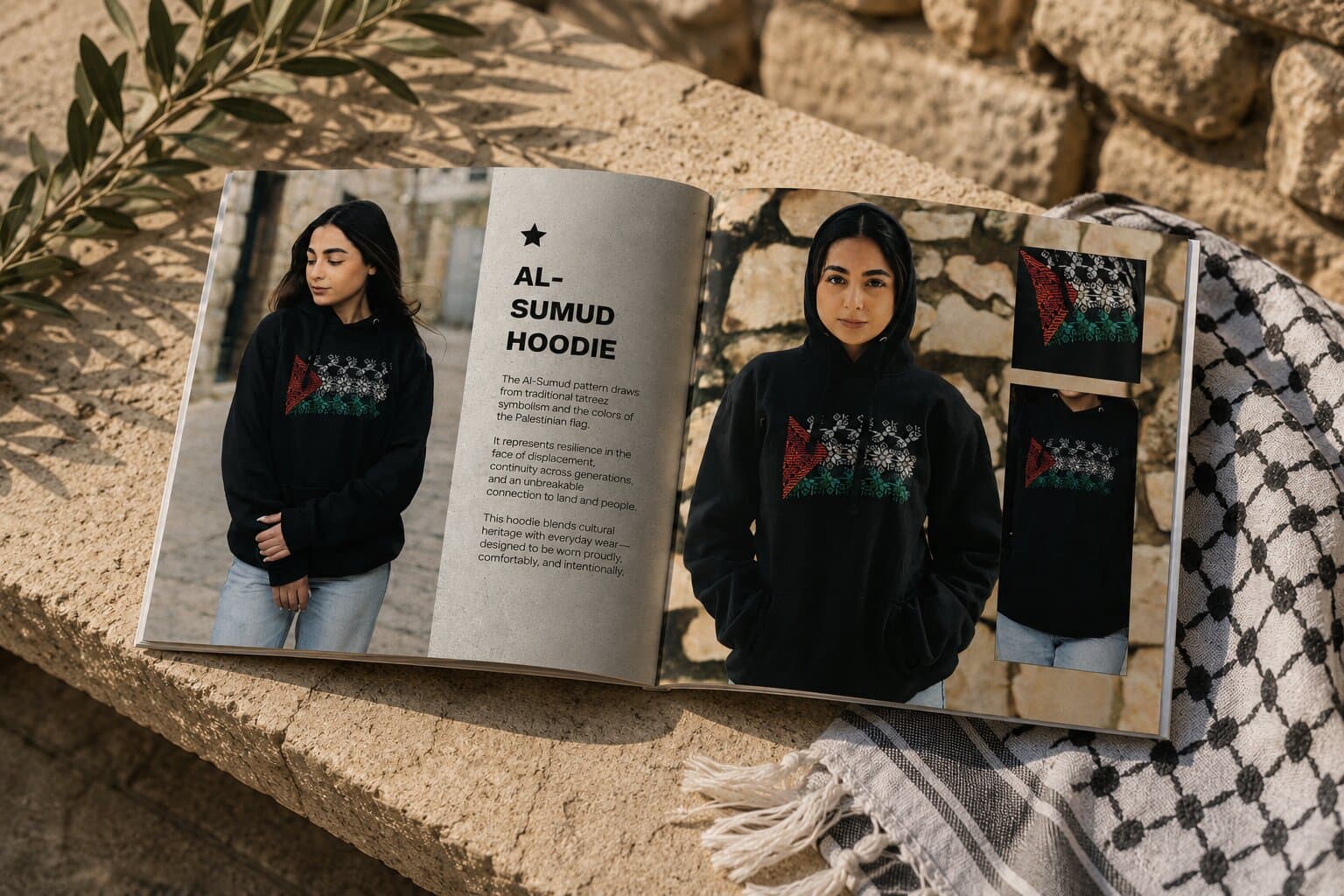
Give every scarf the same frame so the range reads as a range: the product photographed on a person, filling half the page, and a quiet panel opposite carrying the name and three short paragraphs. Keep the format square so it sits as well on a phone as on a table, and make adding a colourway a matter of dropping in a photograph and a name.
The Spread
The book is square, so a spread is two squares: the scarf on the left running to the edge, the words on the right with room to breathe.
Typography
One grotesque, three steps. The product name is set large and tight in caps so a colourway reads at a glance, the body sits at a single size beneath it, and nothing else is introduced — the photograph is doing the persuading.
Product Name
Original White & Black Kuffuyeh
Bold · Uppercase · Tight
Body
This premium Nabulsi Kuffiya Scarf is an authentic product from Palestine.
Regular · Sentence case
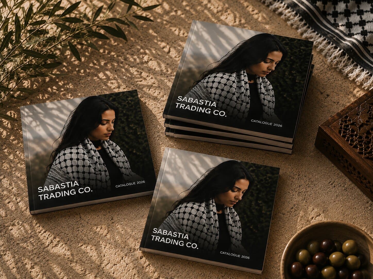
Cover
Sabastia Trading Co.
Bold · Uppercase · Reversed out
Caption
Catalogue 2026
Regular · Uppercase · Letterspaced
Layout
A square page split down the middle: photograph left, panel right. Move across the skeleton to uncover the page it was drawn from.
Visual Elements
Black and red, a star, and a stone panel that lets the weave carry the page. The star marks the top of every entry; the colour switches with the scarf.
The System in Use
The same split, the same three steps of type and the same star — the only thing that changes from entry to entry is the scarf.
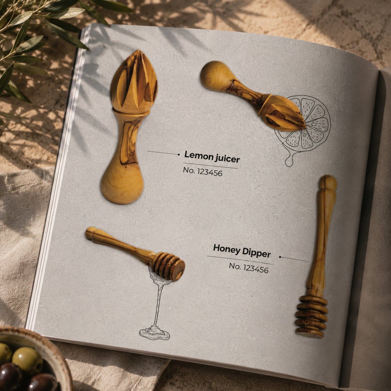
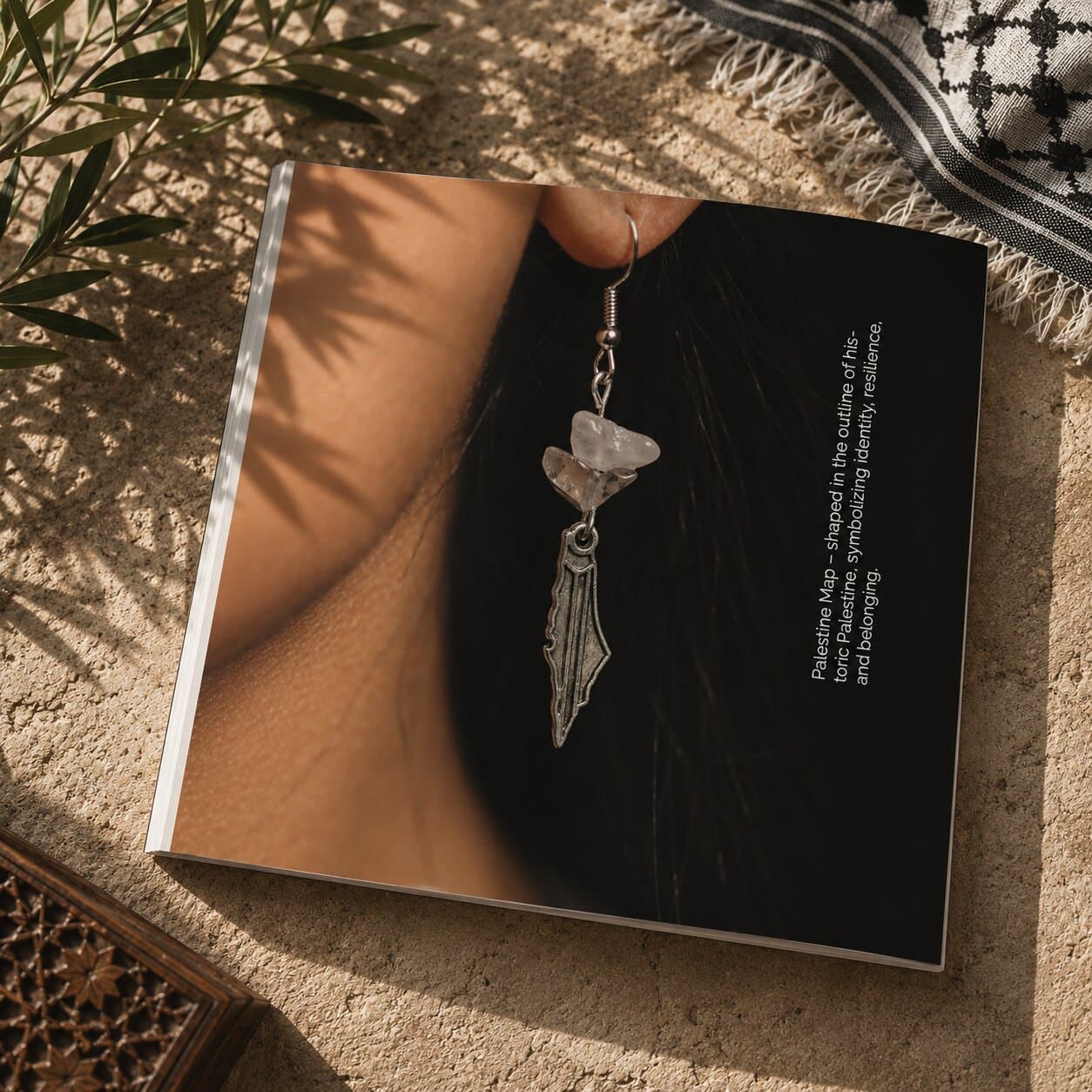
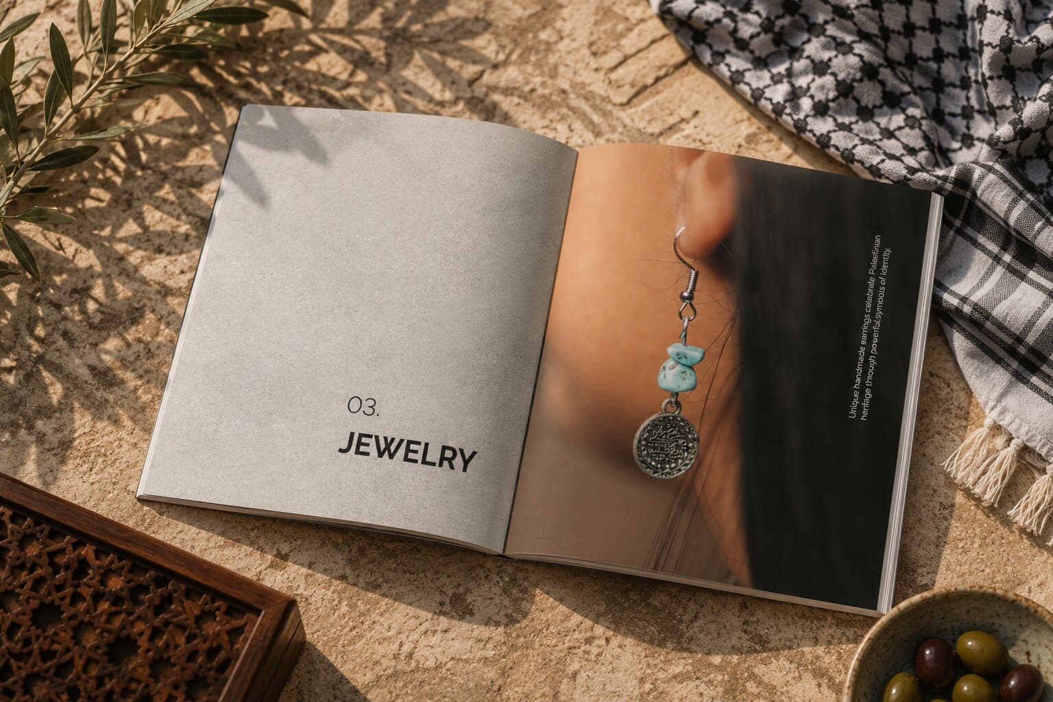
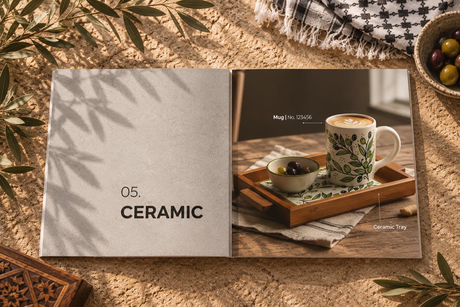
Scaling the System
A new colourway is a photograph, a name and three short paragraphs — the split, the type steps and the star do not move. The square format means the same spread crops cleanly to a product page or a post, so the catalogue does double duty as the shop's photography.
Rights & Credits
Designed for Sabastia Trading Co. Photography, product names and copy belong to the company; the work appears here for portfolio purposes only.
Conclusion
Business Impact
Sabastia has a catalogue that can grow with the range without a redesign, and photography it can reuse everywhere else. Because every entry is built the same way, a buyer comparing two scarves is comparing the scarves rather than two different layouts.
Reflection
The restraint was in what the page does not say. A kuffiyeh is a simple object and the temptation was to compensate with detail — swatches, weave diagrams, a spec table. Half a page of photograph and three short paragraphs turned out to carry more, because it lets the product be looked at rather than read about.
Satisfaction Meter
So... What's the plan?
Tell us where you're headed, and we'll help you get there!
Drop us an email!
info@eureka-creative.studioEureka Creative Studio 2026