
Project Card
Client:
Palestinian Soap Cooperative
Industry:
Olive Oil Soap
Services:
Packaging, Illustration
Timeline:
3 Weeks
Collaborators:
Challenge
The soap had always been wrapped in a particular paper — no carton at all — which works in a shop where someone explains it, and does nothing on a shelf where nobody does. The brief was a box: something that stands up among competitors and is picked up before it is read. It also had to hold a range without flattening what separates one soap from the next, and satisfy an export shelf while still saying plainly where the soap comes from.
Goals
One die, one grid, one set of type rules, and a colour and an illustration per variety. Keep the regulatory panel legible without letting it dominate the front. Make the range legible as a family at a metre and as individual soaps in the hand, and hand the cooperative a template they can extend when the next variety is ready.
Creative Direction
Research
- Target Audience
- Buyers abroad — largely diaspora and speciality grocers — who want the real thing and read the back of the box before they buy.
- Category & Export Research
- Olive-soap packaging abroad splits between rustic kraft that says handmade and clinical white that says cosmetic. Neither carries provenance, and export shelves demand a lot of small mandatory type that most of the category hides badly.
- Key Insights
- The soap itself is plain — a pale cube. The carton has to do all the storytelling, which makes the illustration and the colour the whole differentiator between varieties.
The Visual System
One die and one set of rules, with colour and illustration carrying the difference between varieties.
Colors
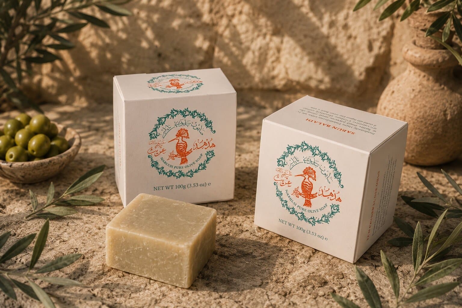
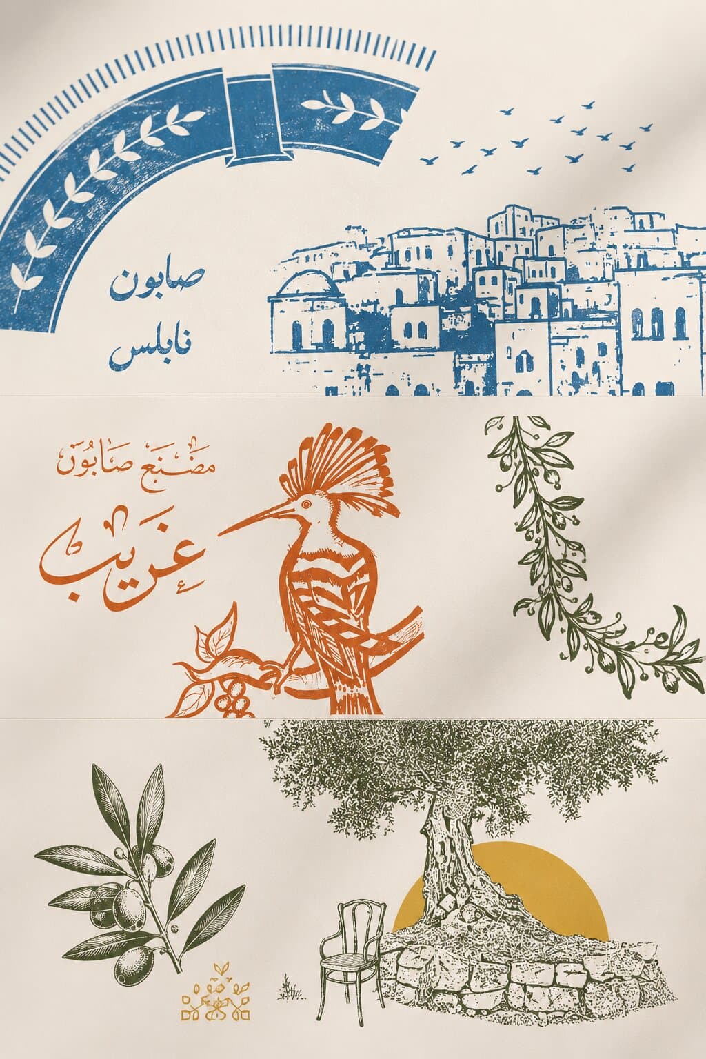
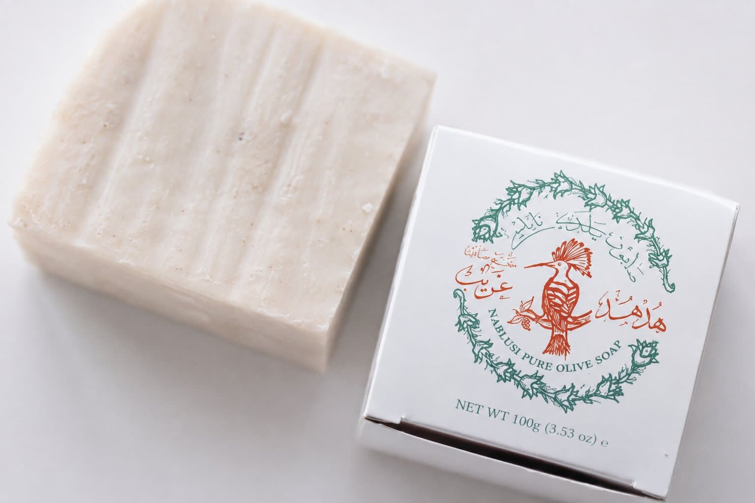
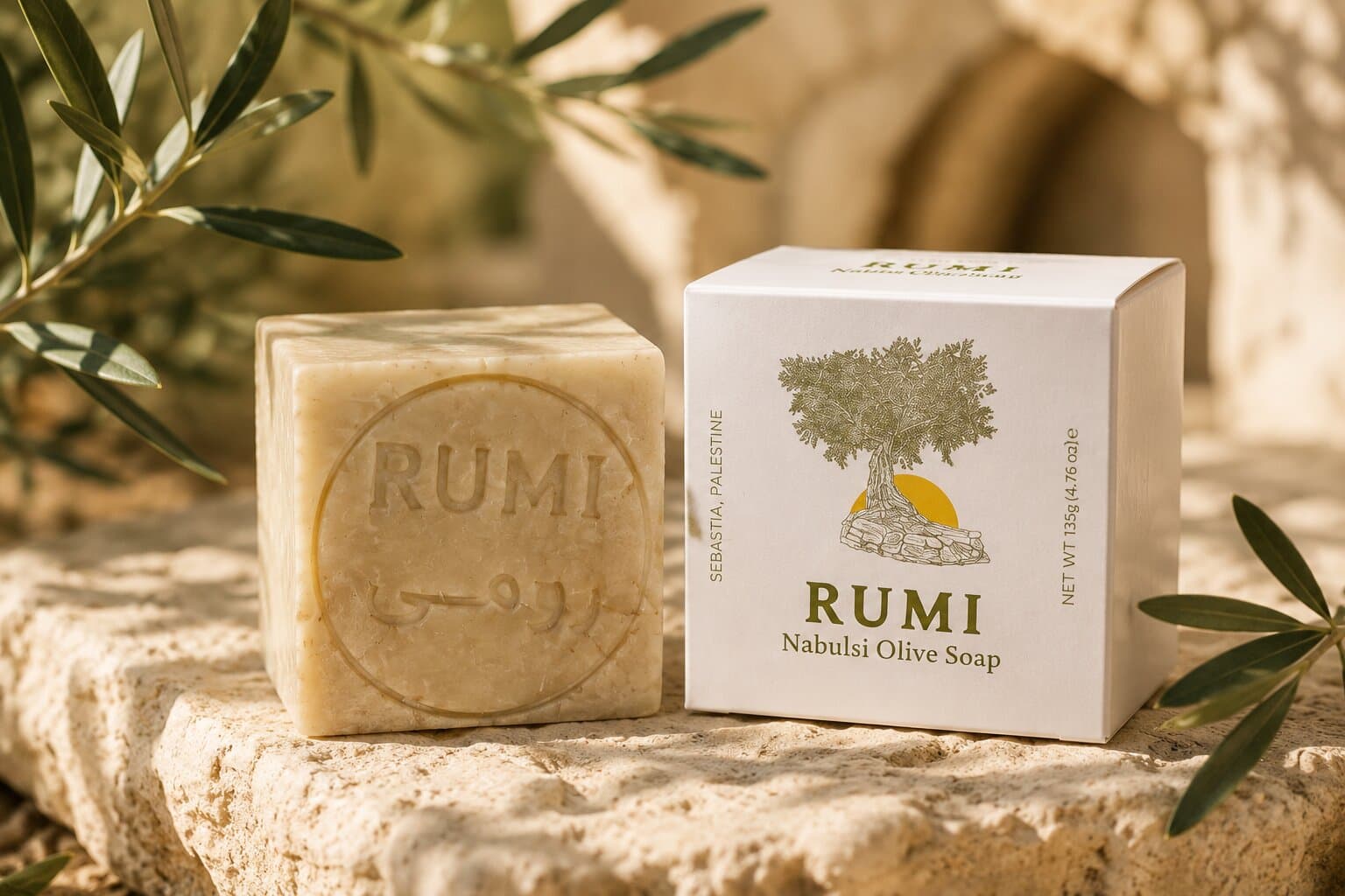
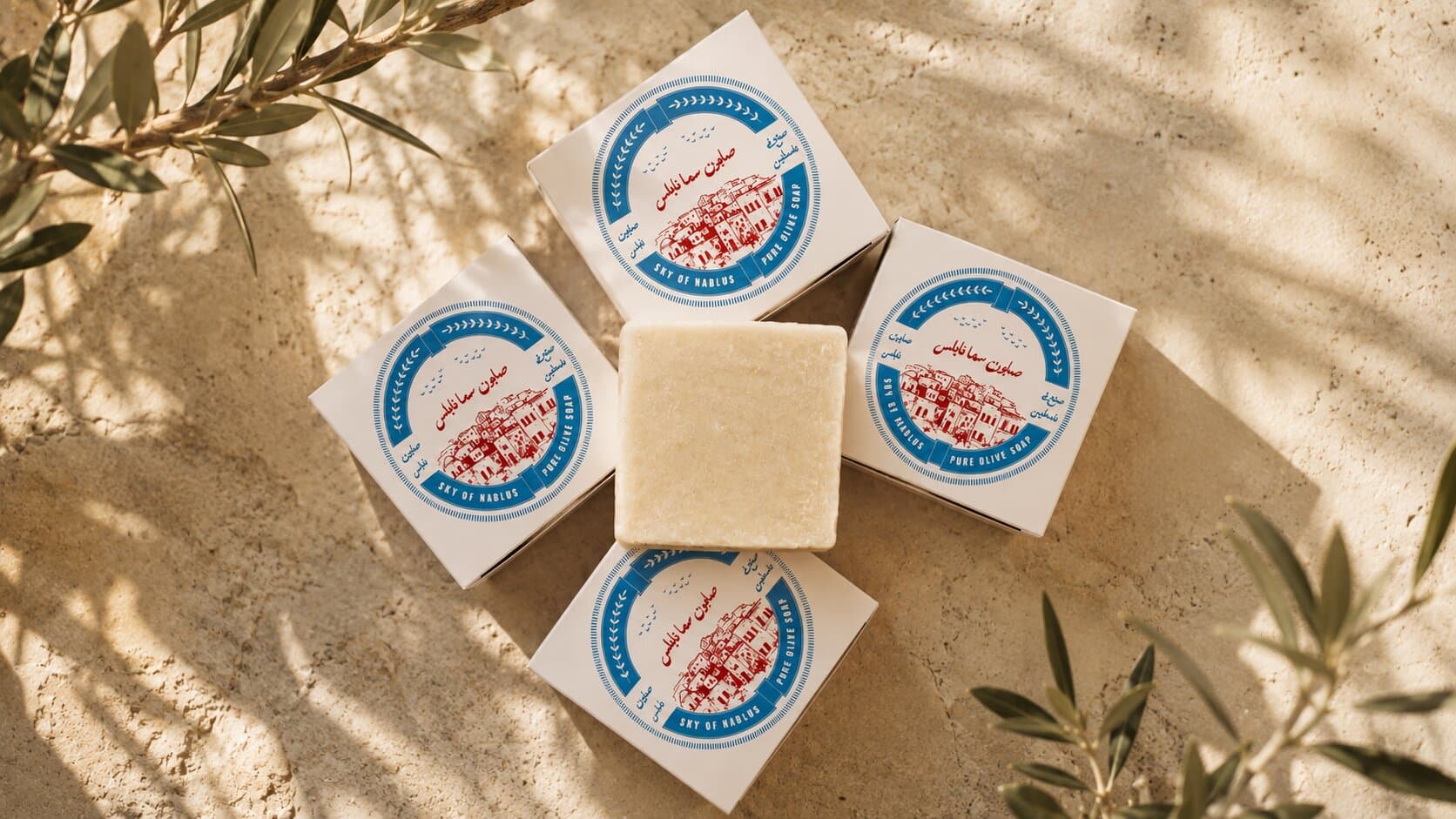
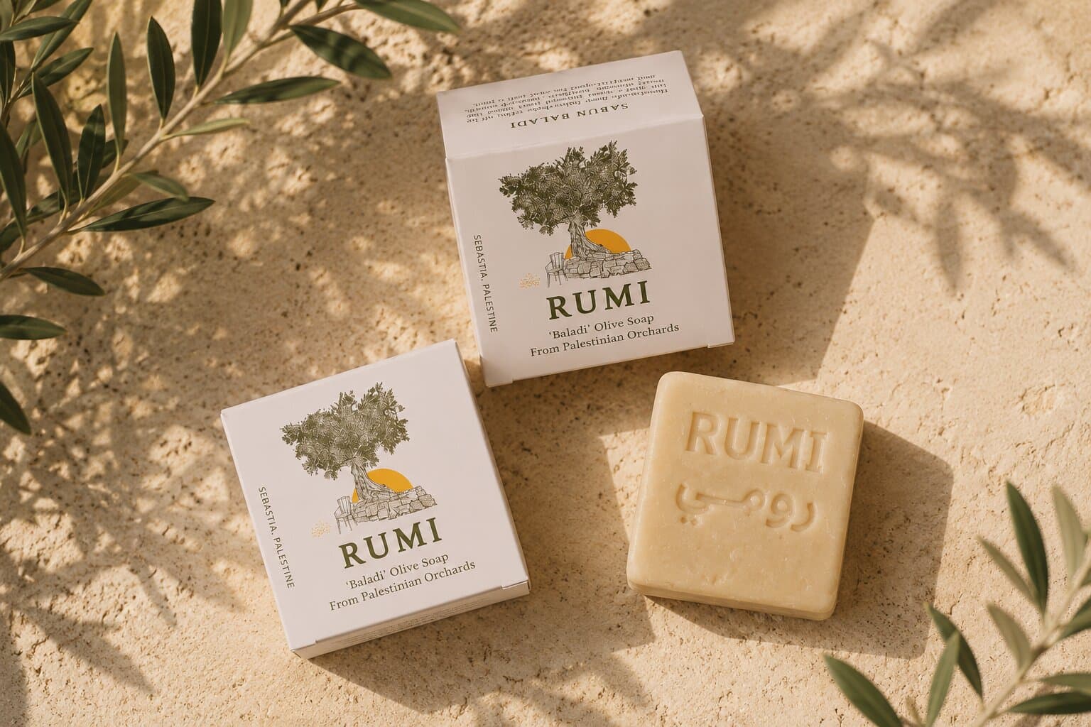
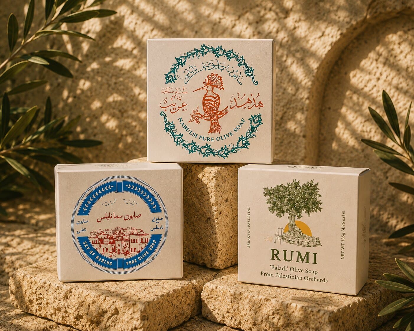
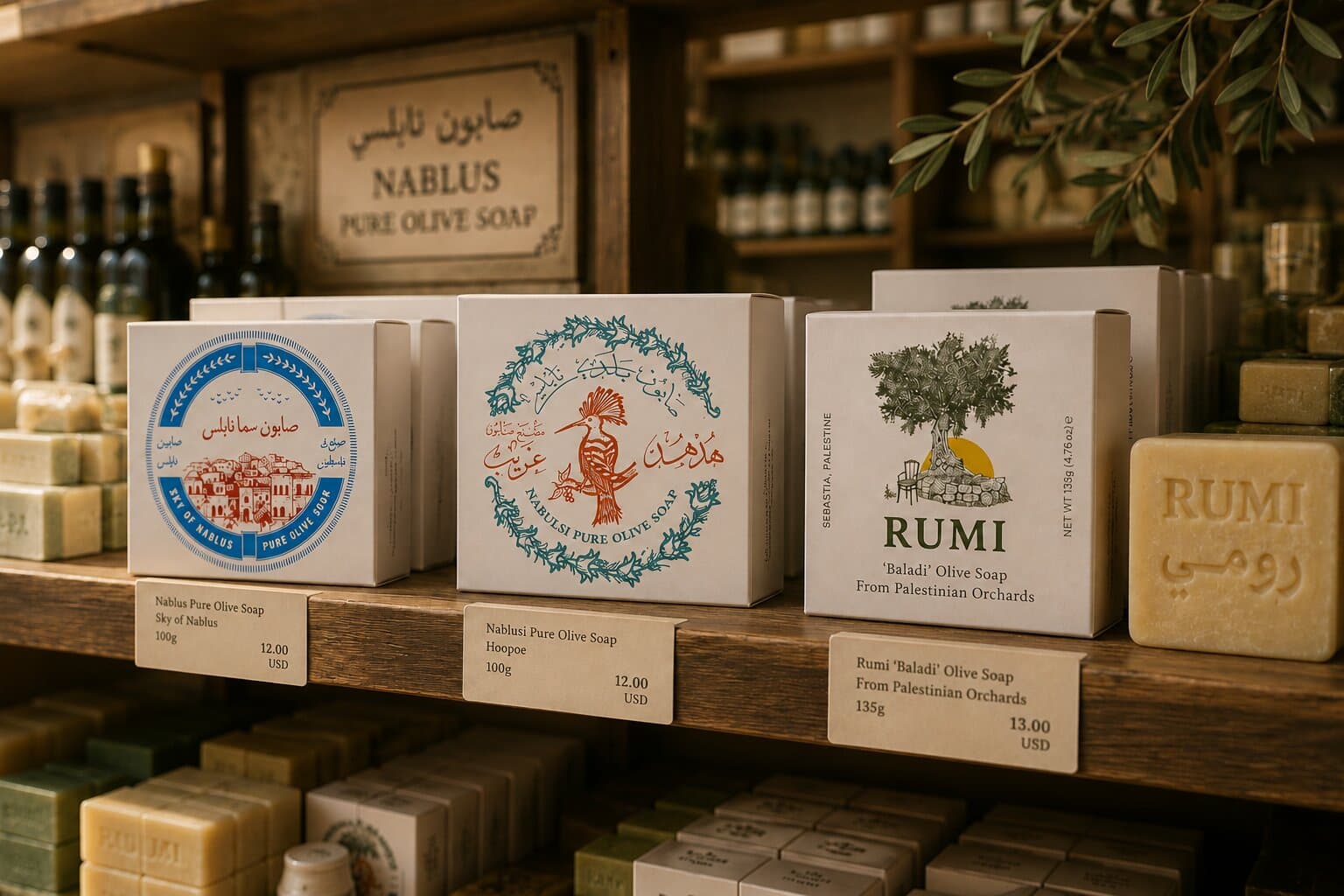
A pair per variety on uncoated white — teal and vermilion for the hoopoe, olive and mustard for Rumi, blue and red for Sky of Nablus — so each soap is its own while the range still reads as one shelf.
Typography
A serif for the name, a plain sans for the duties.
Variety
Rumi
Descriptor
Sabun Baladi
Body
Handmade from Palestinian olive oil by the kettle-fired process used since the tenth century.
Mandatory
For external use only · Net wt 100g
Graphic Elements
A drawn scene per variety inside a wreath or a landscape, the care symbols, and the circular Made in Palestine seal.
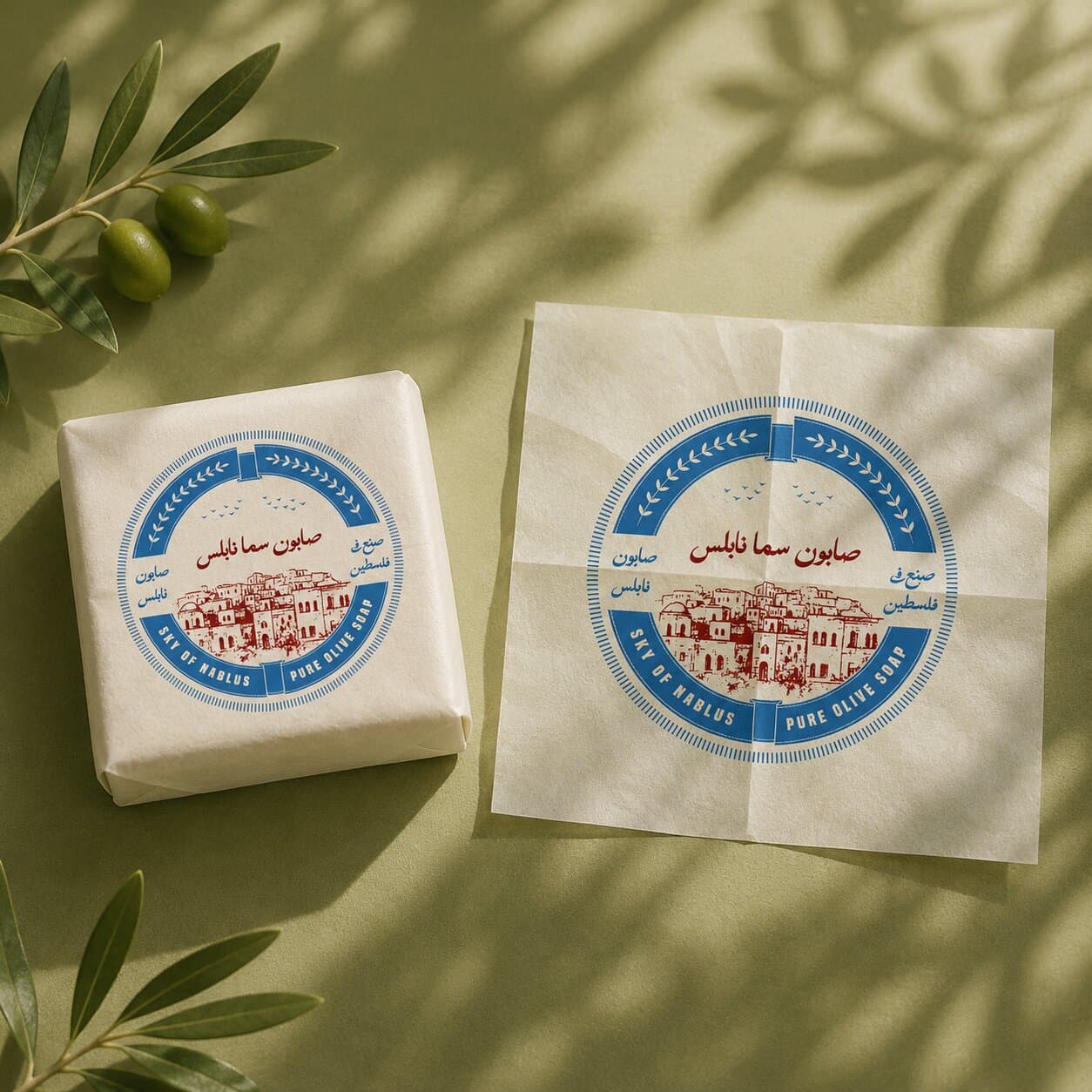
The Old Packaging
What the soap shipped in before: no origin, no ingredients, and nothing to tell one variety from the next on a shelf.
The New Product
The flat sheet the printer works from, cut from a single die. Fold it up to see the carton it becomes.
Tap the box to fold it
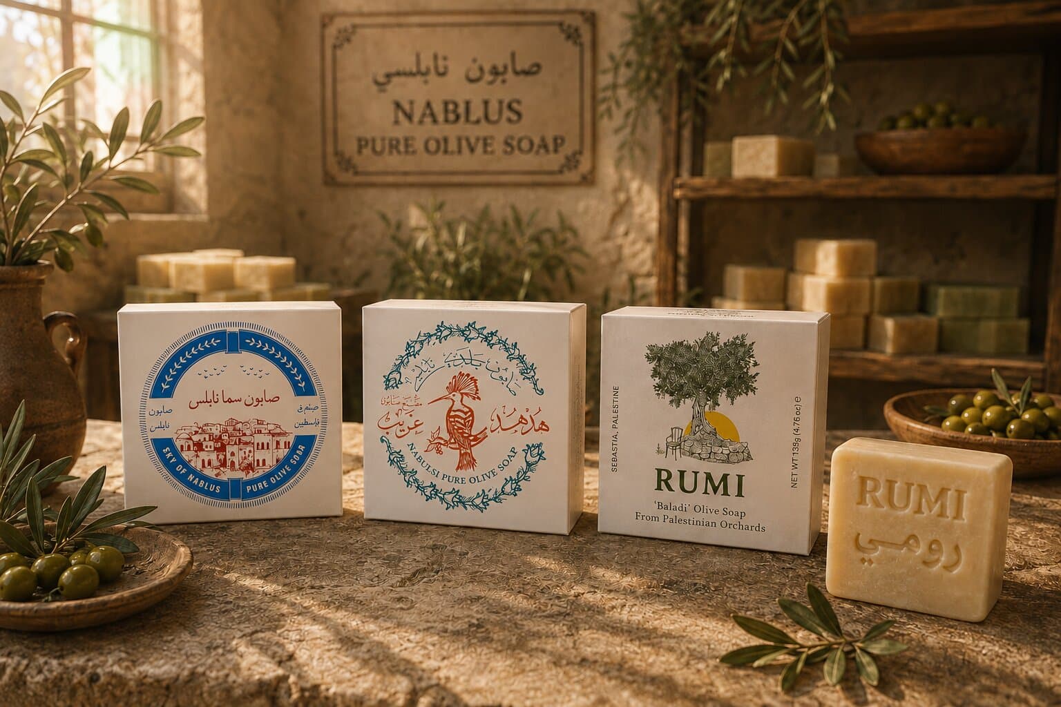
Scaling the System
One die serves the whole range, so a new variety costs a colour, an illustration and a paragraph rather than a new carton. The regulatory panel, the type sizes and the panel order are fixed, which keeps the cooperative's next soap on shelf without another round of studio time.
Rights & Credits
Designed for the Palestinian Soap Cooperative. Brand names, illustrations and product information belong to the cooperative and its member factories; the work appears here for portfolio purposes only.
Conclusion
Business Impact
The cooperative has a carton that satisfies an export shelf and still says where the soap comes from. Because the die and the panel rhythm are fixed, adding a variety is an afternoon rather than a project, and the range holds together in a way that matters most where it is hardest to control — on someone else's shelf, next to soaps that are not theirs.
Reflection
The temptation with a product this plain is to dress the box. What worked was treating the carton like a produce label: draw the specific thing, name the village, print the process on the back, and let the mandatory type sit where it has to sit without apologising for it. The illustrations carry the difference between varieties precisely because the soap inside every box looks identical.
Satisfaction Meter
So... What's the plan?
Tell us where you're headed, and we'll help you get there!
Drop us an email!
info@eureka-creative.studioEureka Creative Studio 2026