The Mark
Two forms meeting mid-conversation — direct, balanced, and legible at the sizes the center uses most.

Project Card
Client:
Talk Training Center
Industry:
Education
Services:
Graphic Design, Re-Branding, Social Media, Printables
Timeline:
3 Weeks
Collaborators:
Talk Training Center had outgrown the mark it started with, and the mark was working against it. It read as a small local tutor rather than an established center, it did not hold up on social — cropped into a profile circle or set against a photograph it simply disappeared — and it was awkward to design around, so every certificate, banner and post had to be solved from scratch. The brief was a brand with a concept strong enough to build on and a mark recognisable at any size, on a screen or in print.
Bring the identity up to the standard of the teaching: clear enough to read at a glance, flexible enough for certificates, signage and social, and warm enough to feel like somewhere you would send your children.
Two forms meeting mid-conversation — direct, balanced, and legible at the sizes the center uses most.
The stacked lockup, for square formats and anywhere the horizontal mark runs out of room.
Two primaries carry the everyday brand; the secondaries mark courses and campaigns so the system can differentiate without redrawing itself.
Primary
Rusty red
#E93640
The brand's voice. Used where the identity needs to assert itself — the mark, headlines and anything that has to be acted on.
Dim grey
#6A6C6C
The steady counterweight. Carries body copy and structure so the red never has to compete for attention.
Secondary
Saffron
#FEC900
Warmth and optimism. Reserved for course materials and moments aimed at younger students.
Verdigris
#00A4AC
Calm and clarity. Used to separate language courses from diploma preparation without a second identity.
Ubuntu handles the working brand; Lalezar carries the moments that need presence. Between them the center can be clear or loud without a third face.
Ubuntu
_Open, humanist, legible down to certificate small print.
Body · Documents · Wayfinding
Lalezar
_Heavy, warm, and equally at home in Arabic and Latin.
Display · Campaign · Signage
A set of marks drawn from the logo's geometry, used across course materials and social where the full lockup would be too much.
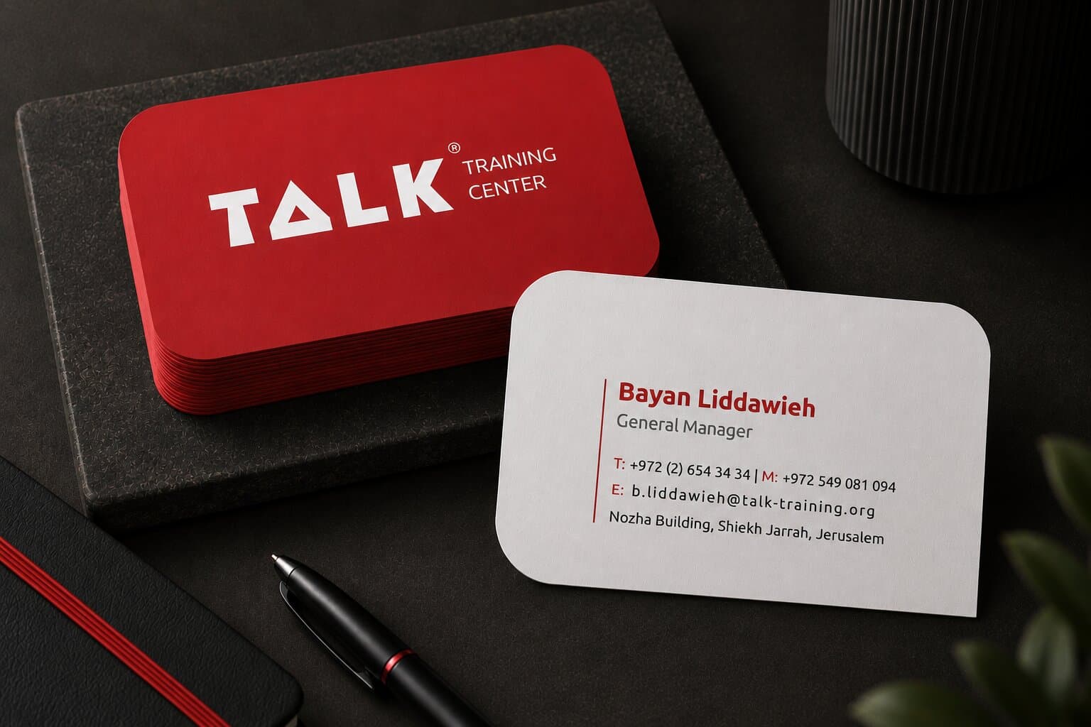
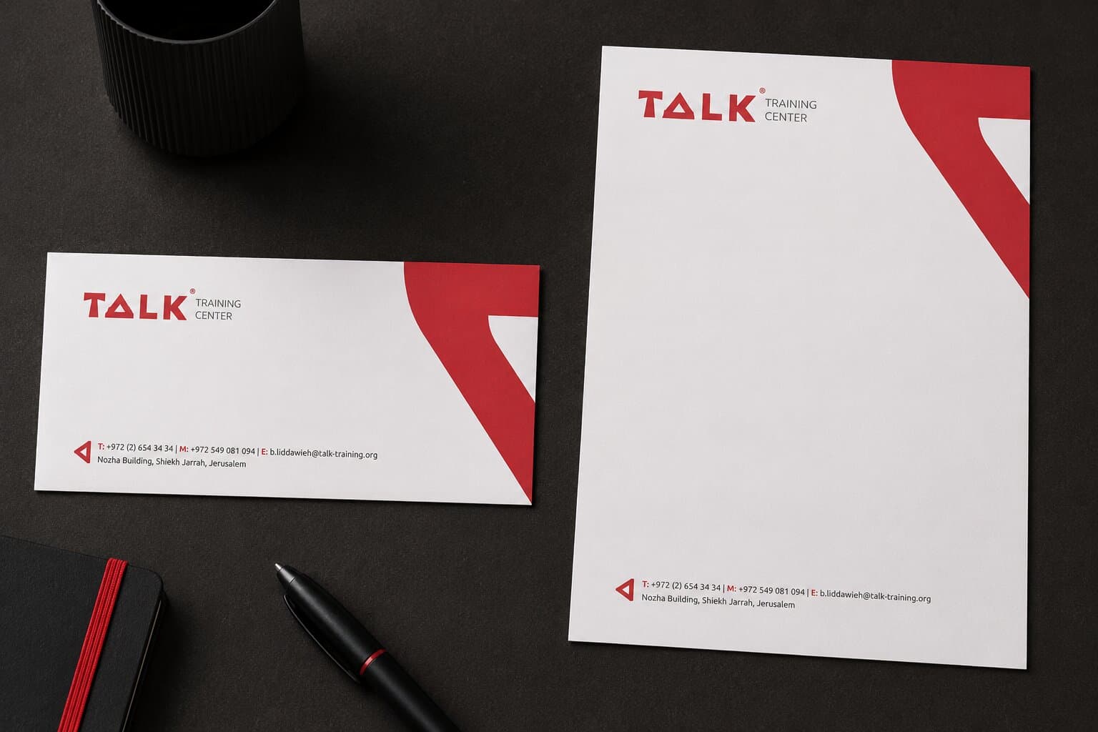
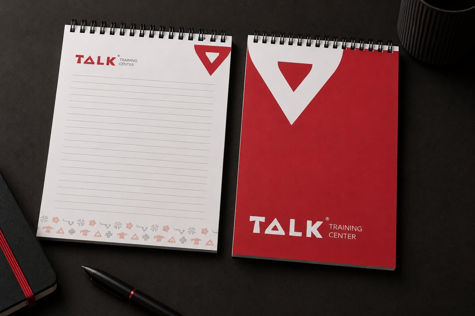
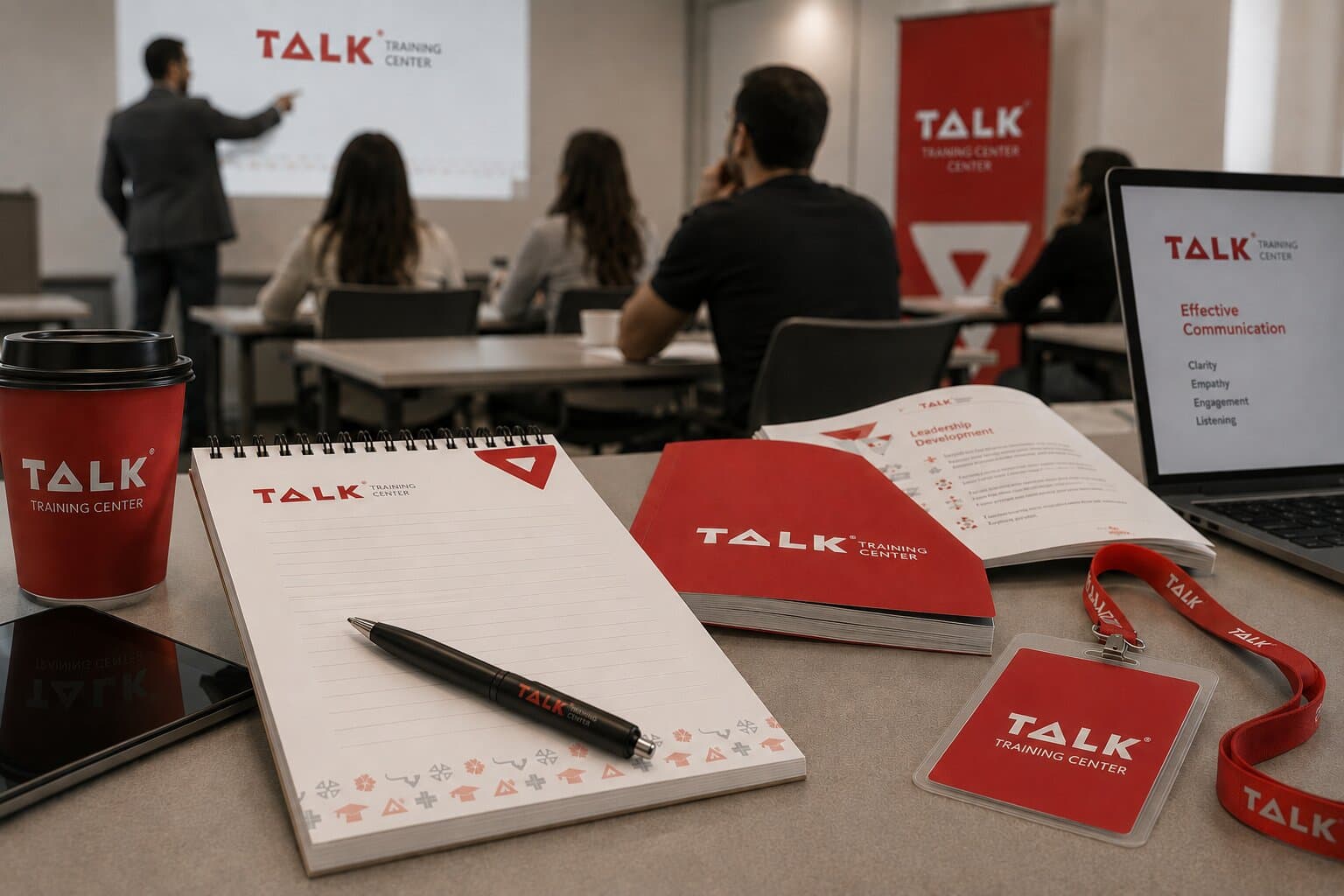
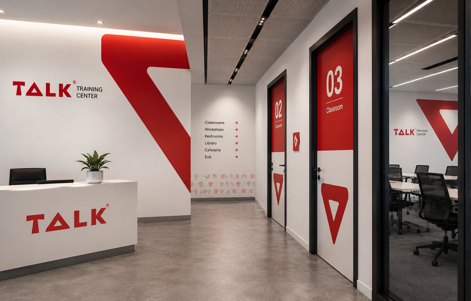
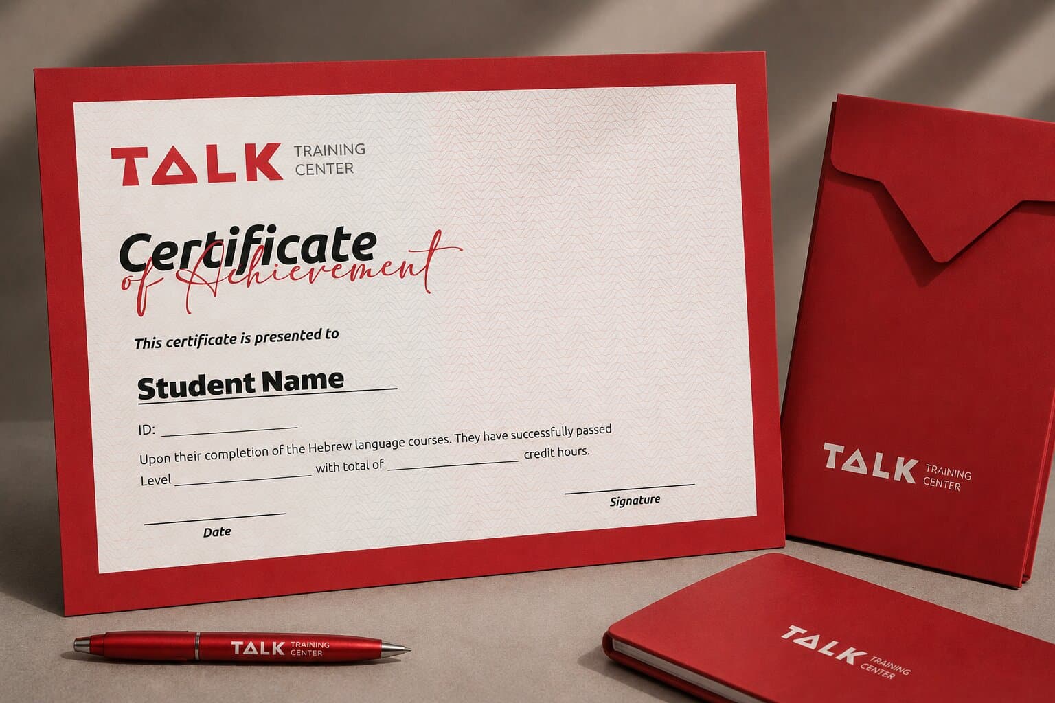
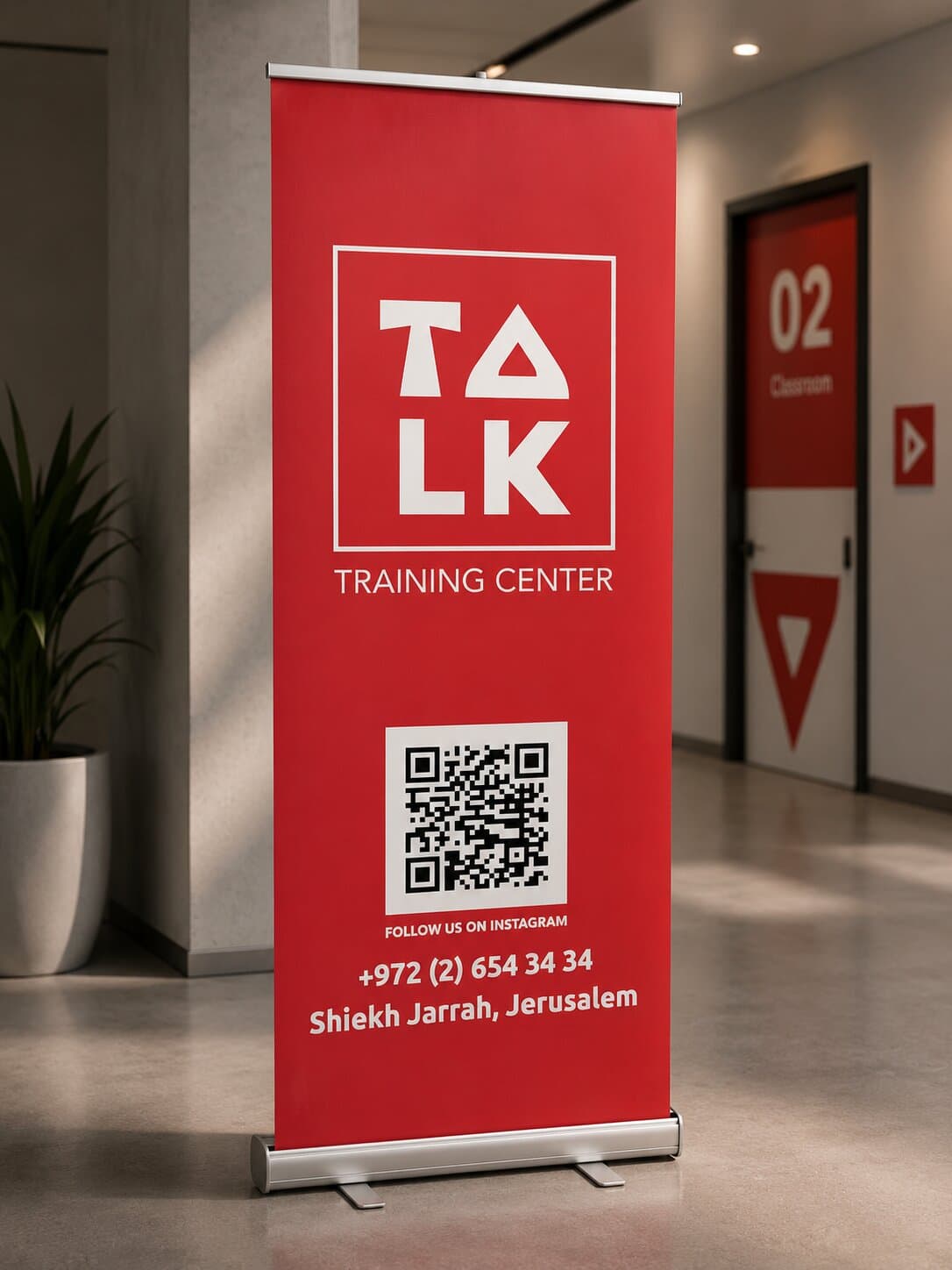
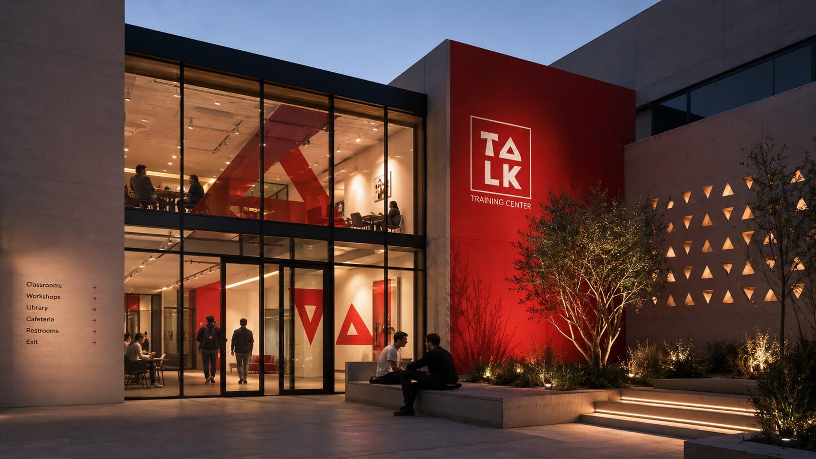
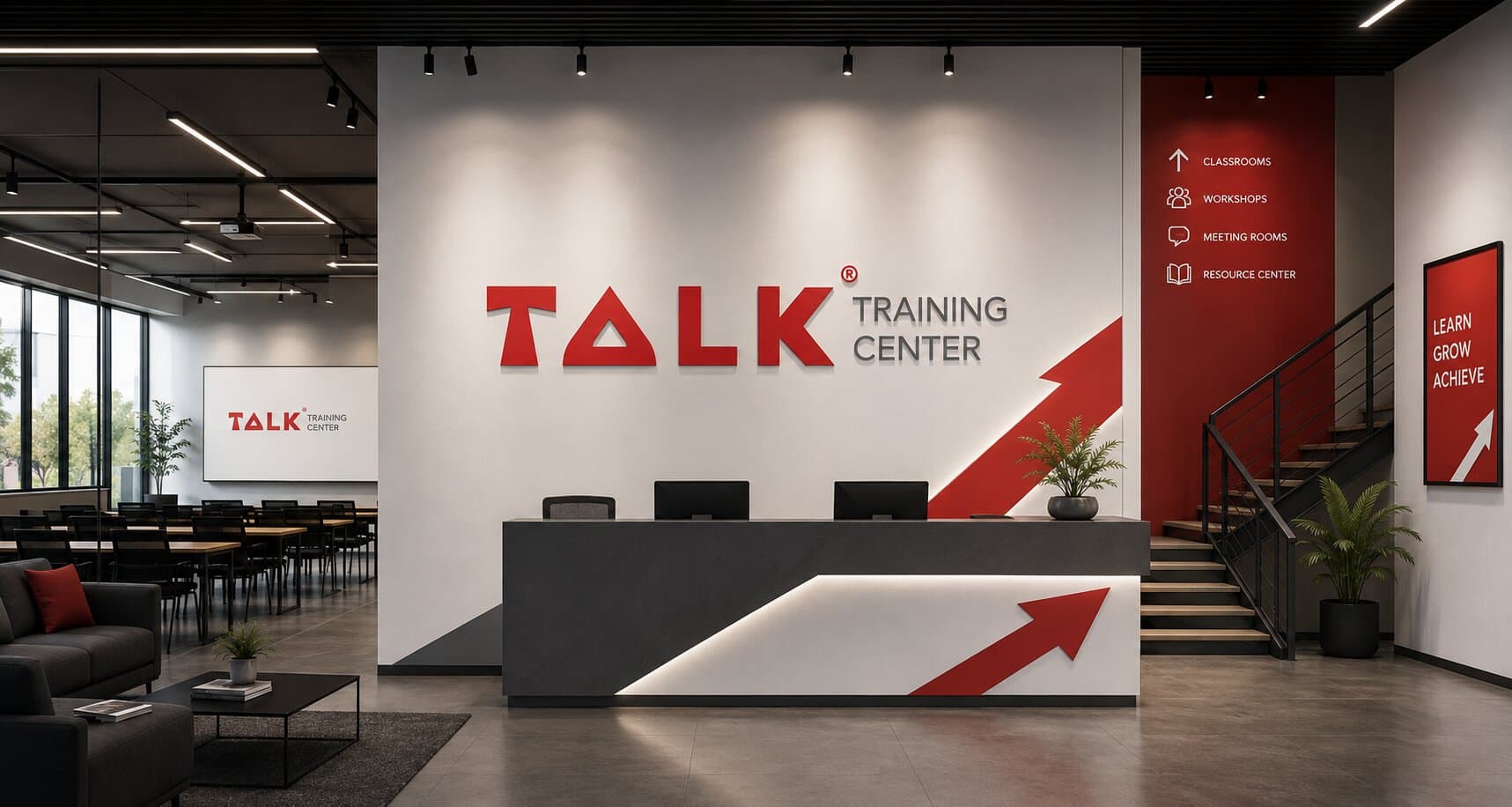
The identity applied — course materials, social and the pieces the center hands to students.
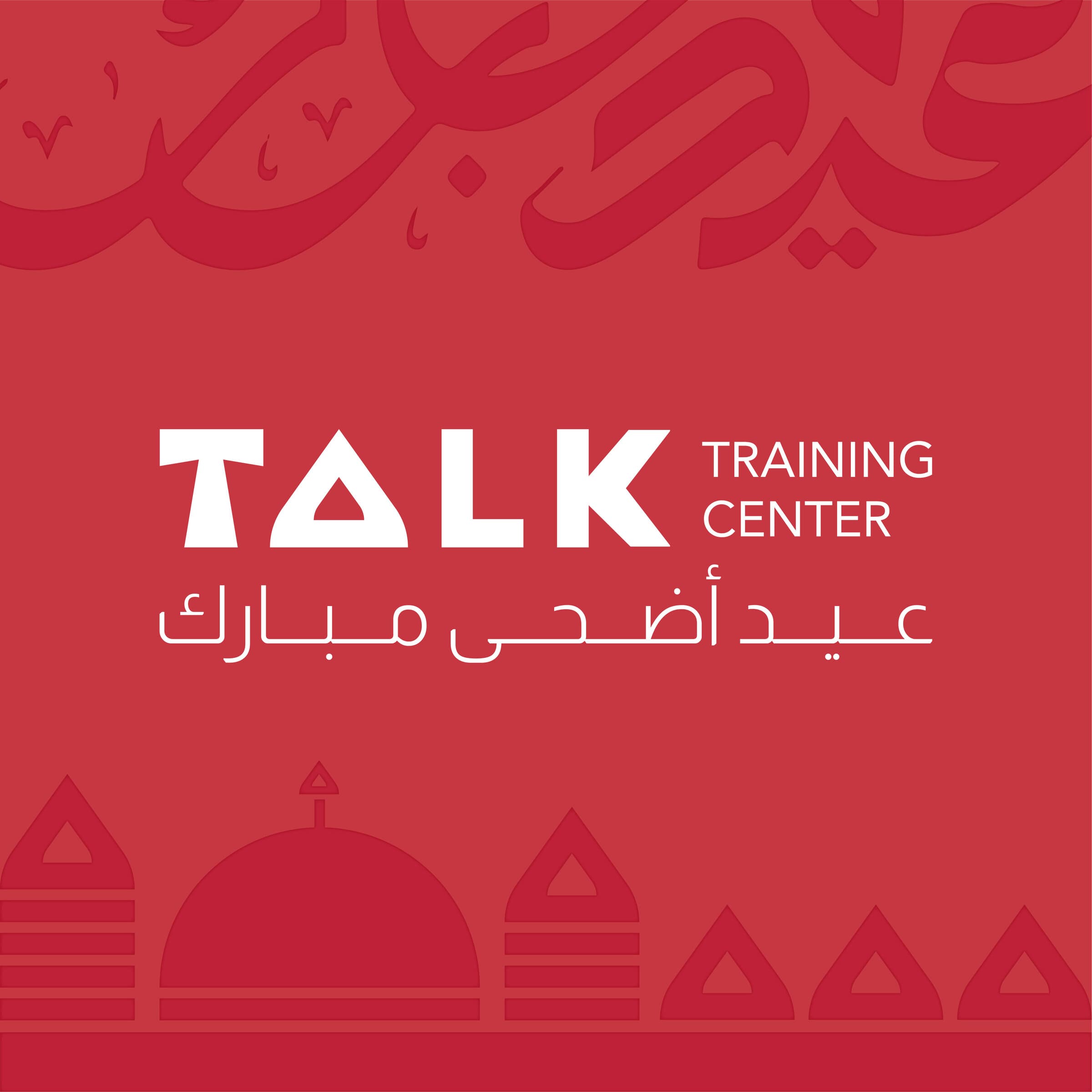
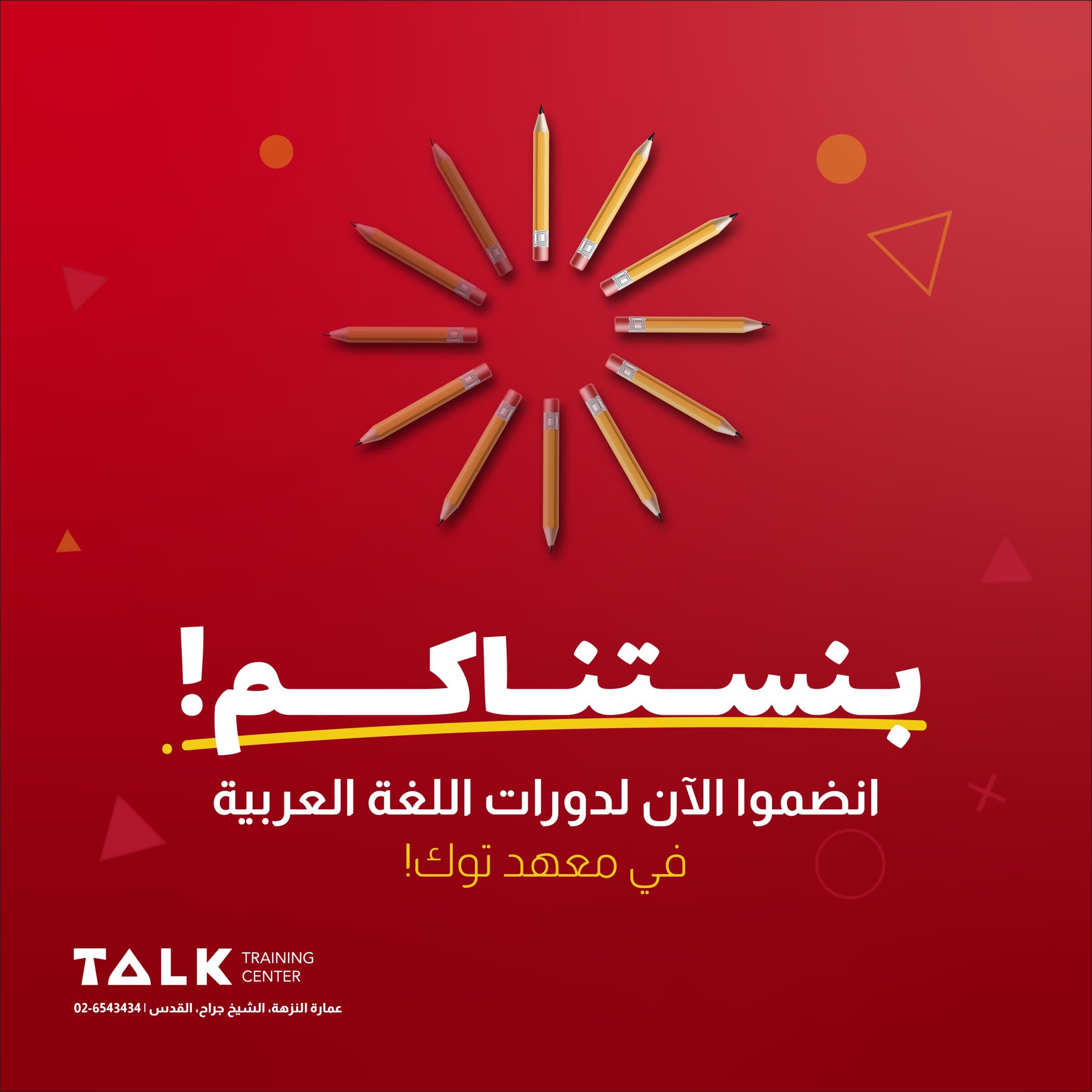
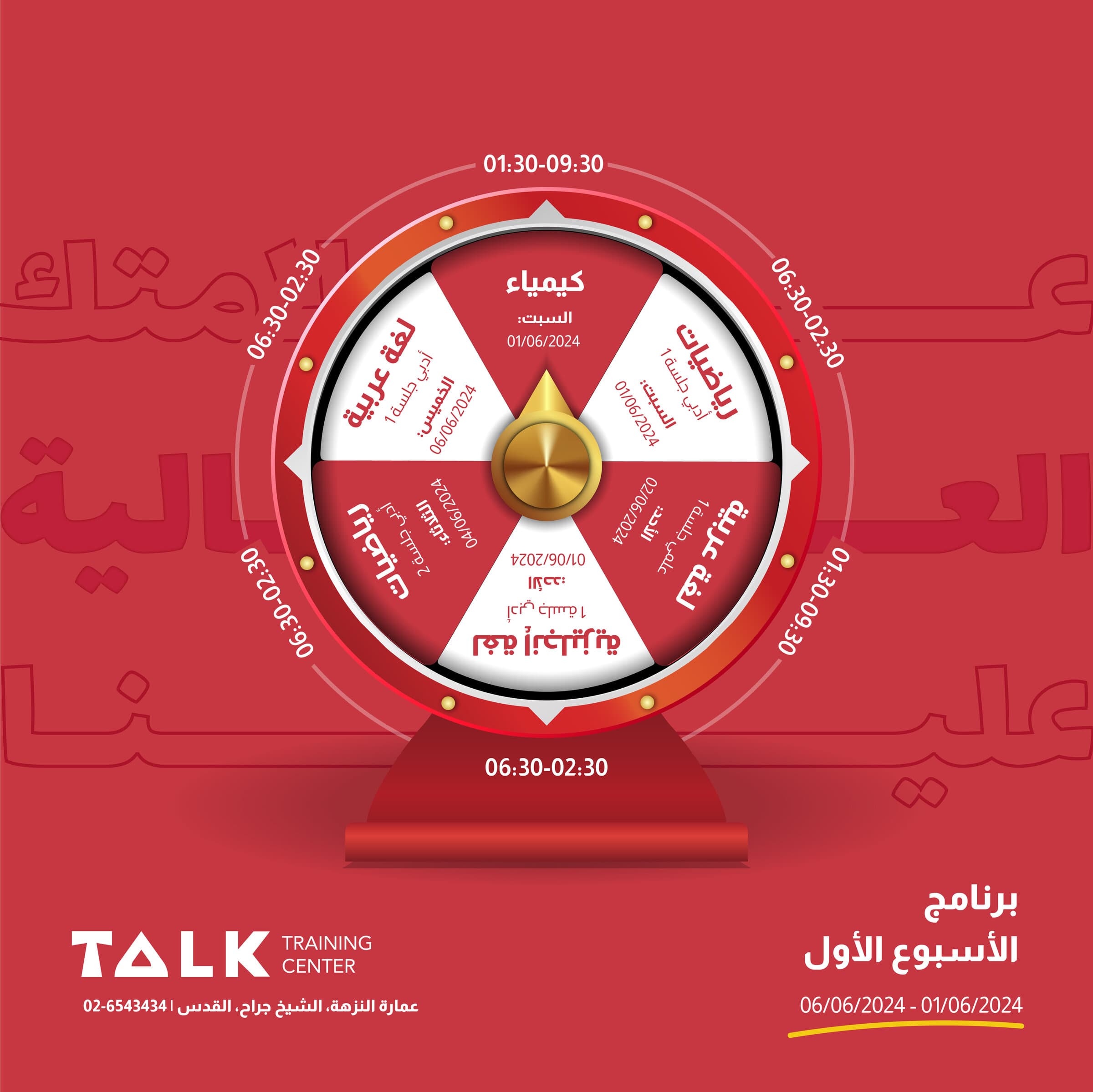
The identity was built for the sizes the center actually works at. The same proportions hold from a certificate seal to building signage, and the secondary palette lets course materials differentiate without a second brand. Social, print and wayfinding all draw from one kit.
All work shown here was produced for Talk Training Center. Brand assets, imagery and trademarks remain the property of the client and appear here for portfolio purposes only.
The center now has one kit covering certificates, signage, course materials and social, rather than commissioning each piece separately. Staff can produce campaign material in-house without the identity drifting, and the mark finally survives the small sizes it is used at most.
The hard part was rebranding without discarding recognition the center had built locally over years. Keeping the name's spoken emphasis while rebuilding everything around it let the identity move on without asking its audience to relearn it.
Tell us where you're headed, and we'll help you get there!
Drop us an email!
info@eureka-creative.studioEureka Creative Studio 2026